This matrix compares the shared mobile feature set across Android and iOS. A checkmark means the feature is present in the mobile source for that platform. Platform notes call out behavior, presentation, or screenshot differences that a user may notice.
Verification scope: Android features were checked against android/app/src; iOS features were checked against ios/CodeOverlord. Screenshot coverage comes from the curated cross-platform captures in docs/user-guide/assets/mobile/cross-platform/.
| Mark |
Meaning |
| ✓ |
Available in source for that platform |
| - |
Not found for that platform, or not part of the current shared surface |
| Build/config |
Present in source but may depend on build flavor, permissions, account state, relay state, or environment configuration |
| Feature |
Android |
iOS |
Notes |
| First-run welcome |
✓ |
✓ |
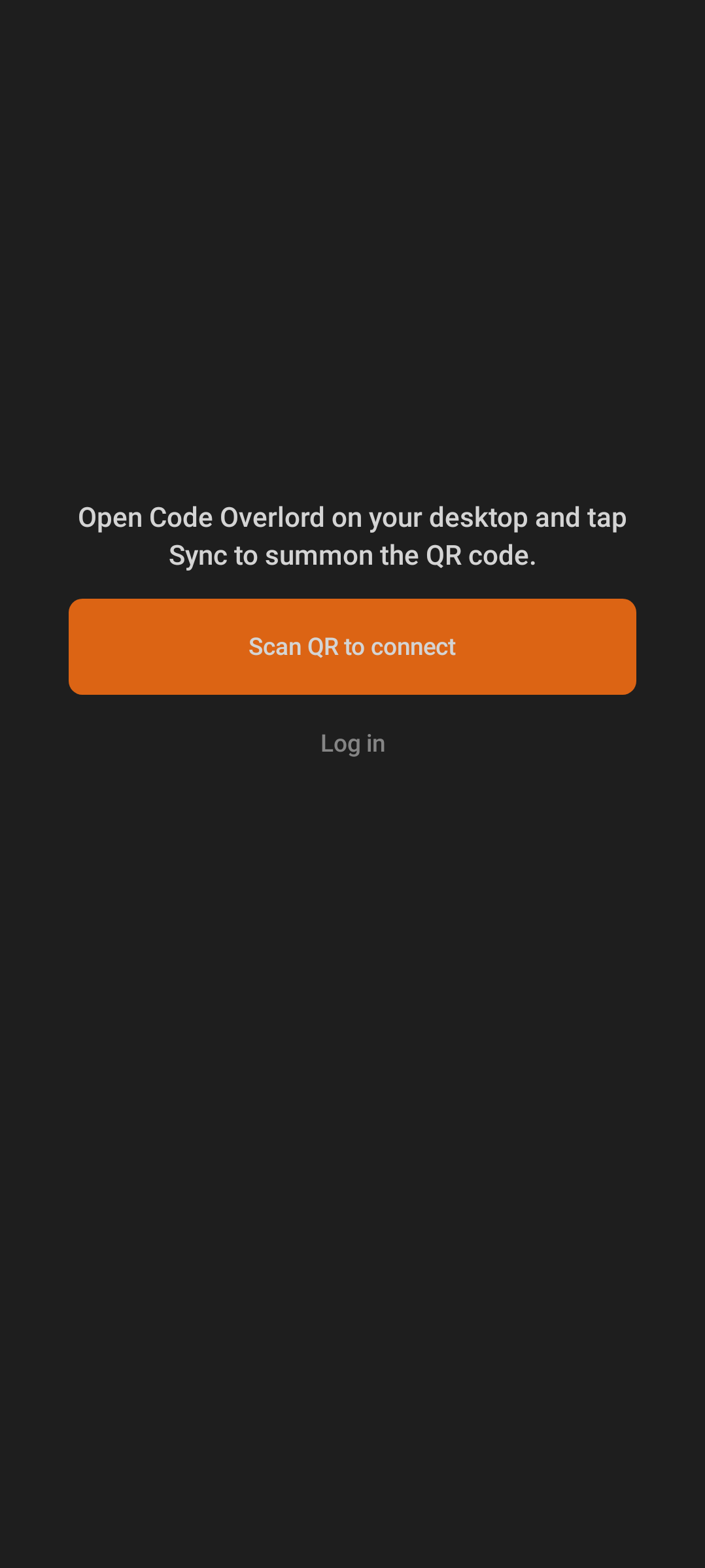
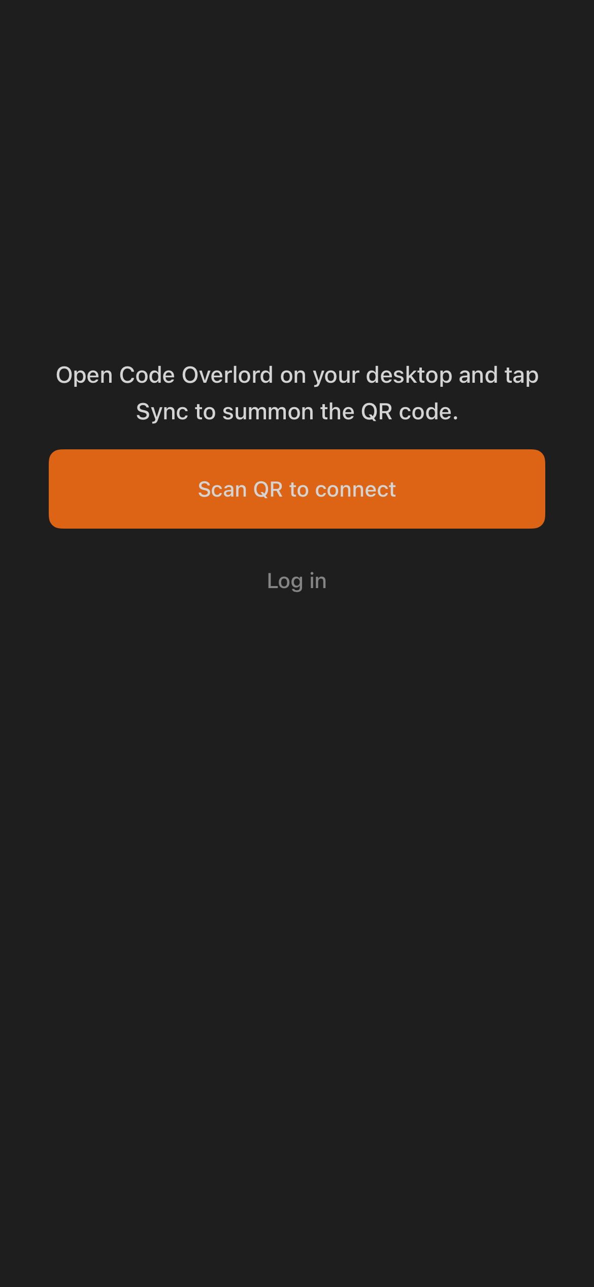
Both start by explaining that the desktop Sync screen provides the QR code. |
| QR pairing scanner |
✓ |
✓ |
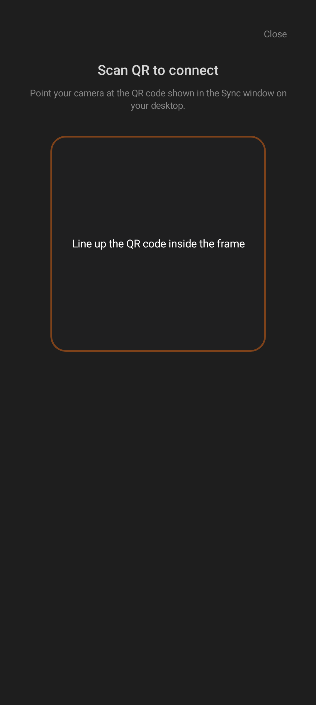
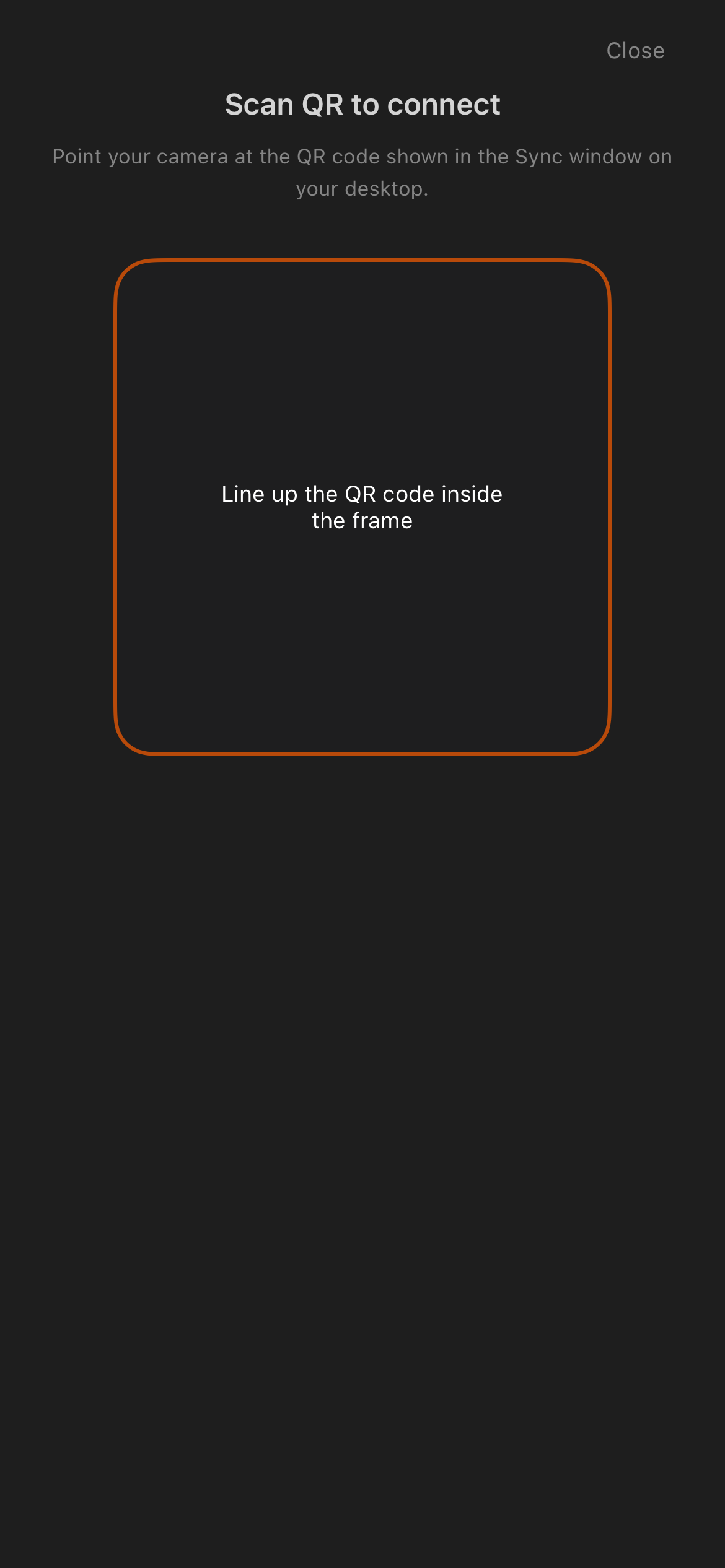
Both use a framed camera scanner for the desktop pairing code. |
| Camera permission recovery |
✓ |
✓ |
Permission denial is handled with platform-native prompts or recovery states. |
| Login fallback |
✓ |
✓ |
Users can choose account login instead of QR pairing. |
| Google login |
✓ |
✓ |
Account availability depends on the configured auth provider. |
| Apple login |
✓ |
✓ |
Available in source on both platforms; platform presentation differs. |
| Email sign in |
✓ |
✓ |
Both support email/password sign in. |
| Email sign up |
✓ |
✓ |
Both include account creation and confirmation flow support. |
| Session restore |
✓ |
✓ |
Both rehydrate the signed-in Cognito session, paired-device tokens, and relay configuration when available. |
| Onboarding quick tour |
- |
- |
A quick-tour screen exists in the iOS codebase and this screenshot set, but it is not wired into the shipping onboarding on either platform — the live route goes welcome → pairing or login. Android has no quick-tour screen at all. Treat the capture below as a design artifact. |
| Sign out |
✓ |
✓ |
Labeled "Retreat! (sign out)" in Armoury on both platforms. |
| Realm/environment switch |
Build/config |
Build/config |
Only the bridge/staging build flavor exposes realm selection (Android BuildConfig.BRIDGE; iOS STAGING build). Standard release builds hide it. |
| Android |
iOS |
 |
 |
| Android welcome and pairing entry. |
iOS welcome and pairing entry. |
| Android |
iOS |
 |
 |
| Android scanner. |
iOS scanner. |
| Android |
iOS |
 |
 |
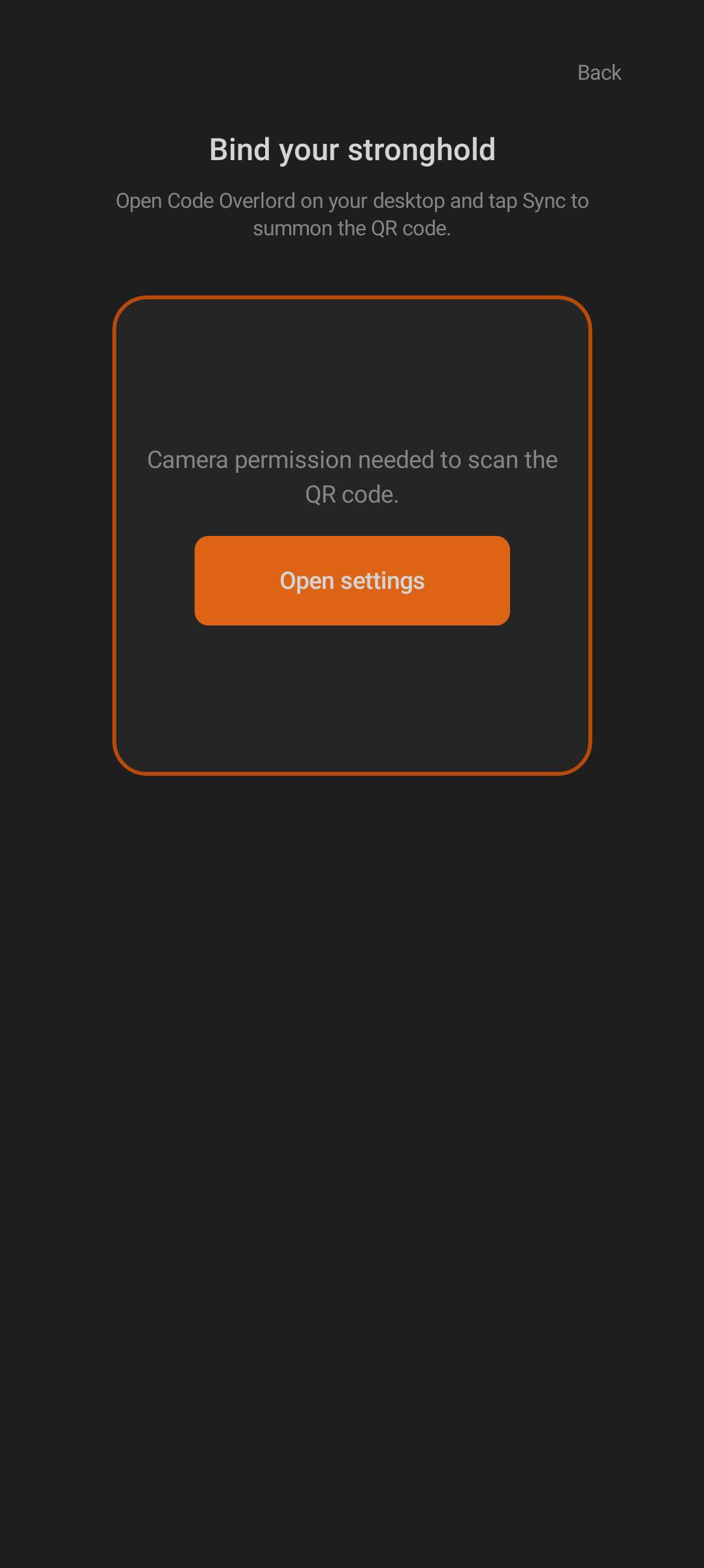
| The "Bind your stronghold" pairing screen. When the camera is blocked, both platforms show a recovery card with a direct "Open settings" button. |
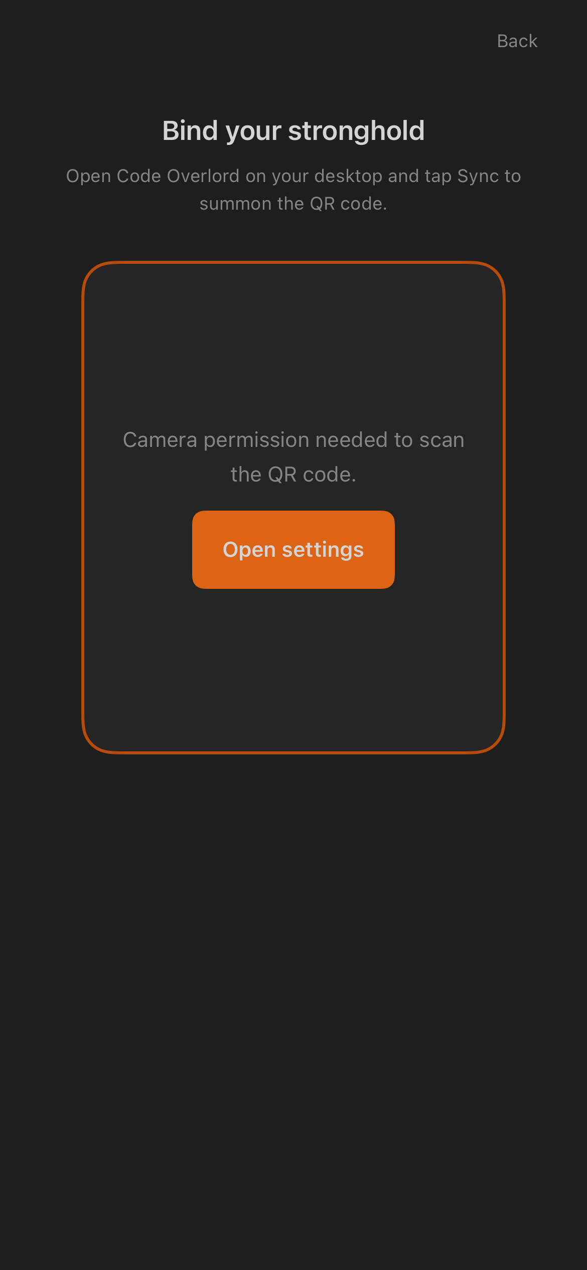
iOS uses the same "Bind your stronghold" screen and camera-permission recovery. |
| iOS-only screenshot |
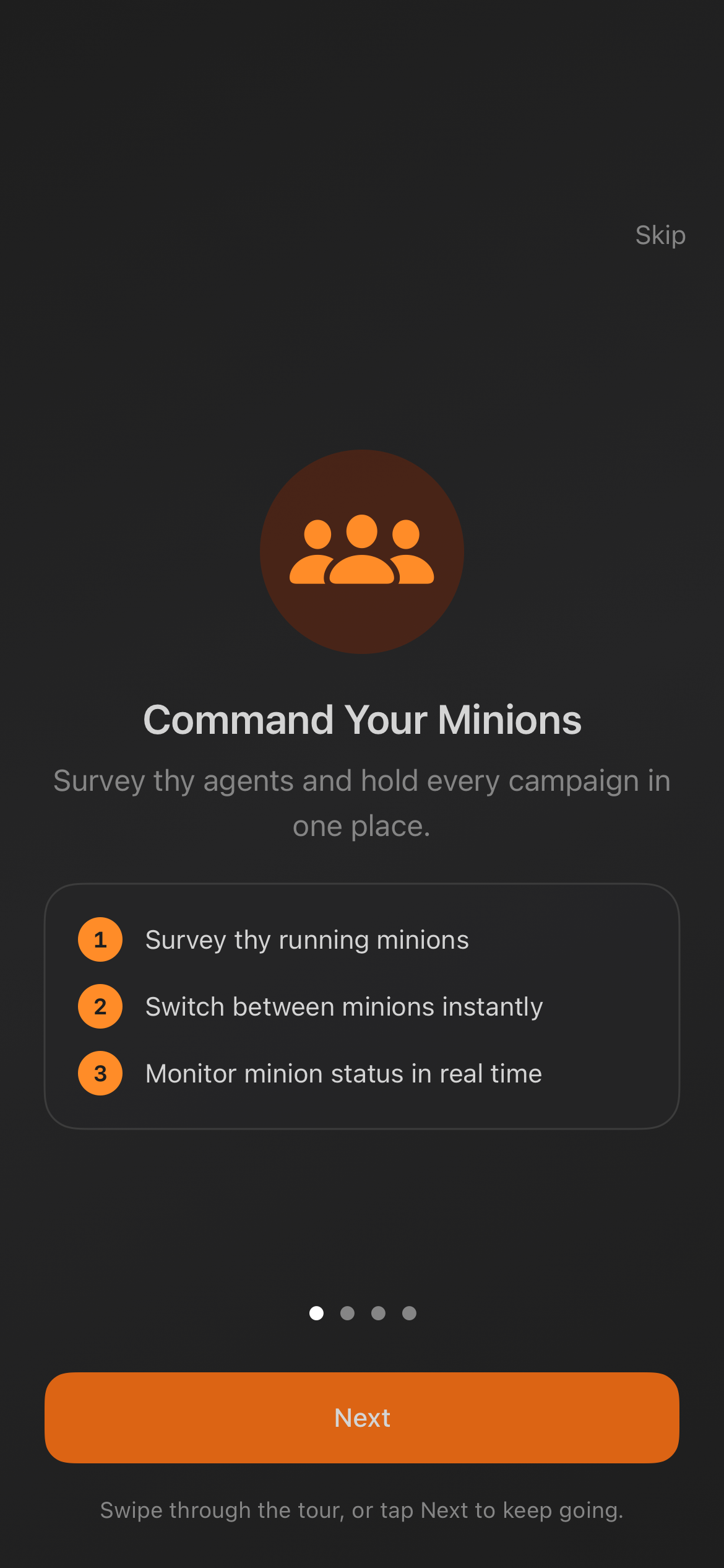 |
| The quick-tour capture exists only for iOS, and even there it is not part of the live onboarding route (welcome → pairing/login). Android has no equivalent screen. |
| Feature |
Android |
iOS |
Notes |
| Five main mobile areas |
✓ |
✓ |
The five bottom tabs — Thy Quill, Minions, Scrolls, Rituals, Omens — are shared and use the same labels on both platforms. |
| Armoury settings |
✓ |
✓ |
Not a bottom tab on either platform. Android opens Armoury from the Thy Quill top-bar gear (a full screen); iOS presents it as a slide-up sheet. |
| Workspace selector |
✓ |
✓ |
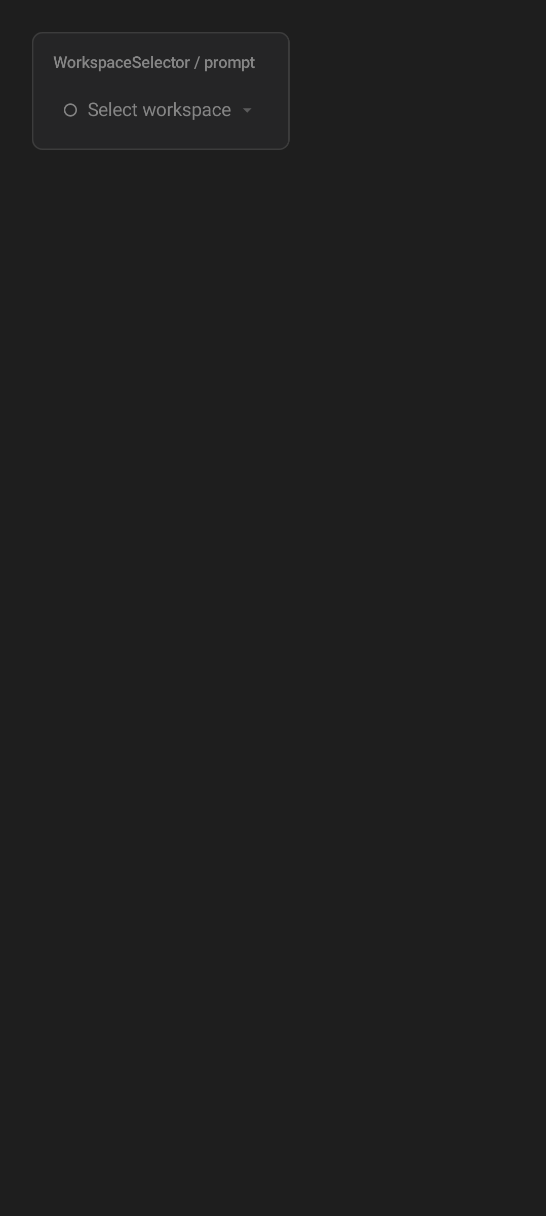
Both show the current workspace and let users switch active workspace. |
| Hide and restore workspaces |
✓ |
✓ |
Both include workspace visibility management. |
| Workspace identity colors |
✓ |
✓ |
Workspace colors are deterministic so the same workspace remains recognizable. |
| Desktop online/offline state |
✓ |
✓ |
Relay-backed screens show connected, disconnected, or cached states. |
| Refresh/polling states |
✓ |
✓ |
Both show loading and retry behavior for relay-backed views. |
| Notification badges |
✓ |
✓ |
Omens can badge mobile navigation when unread activity exists. |
| Feedback launcher |
✓ |
✓ |
Both expose a lightweight way to send feedback, optionally with a screenshot. |
| Android |
iOS |
 |
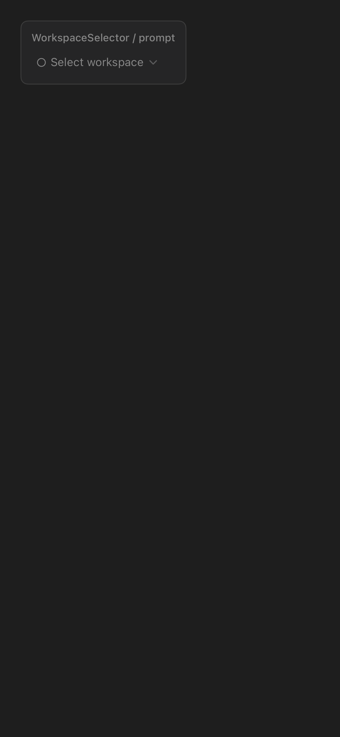 |
| Android workspace selector. |
iOS workspace selector. |
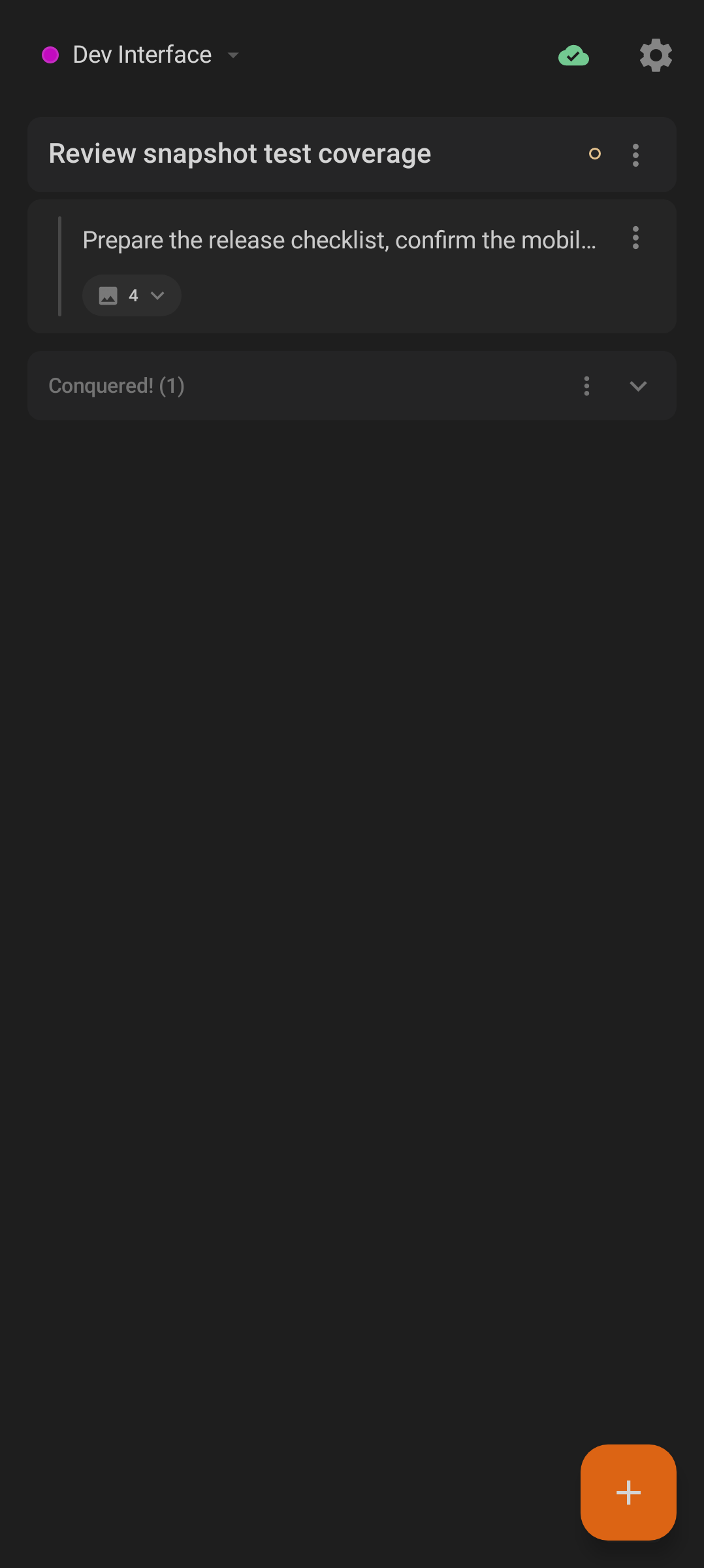
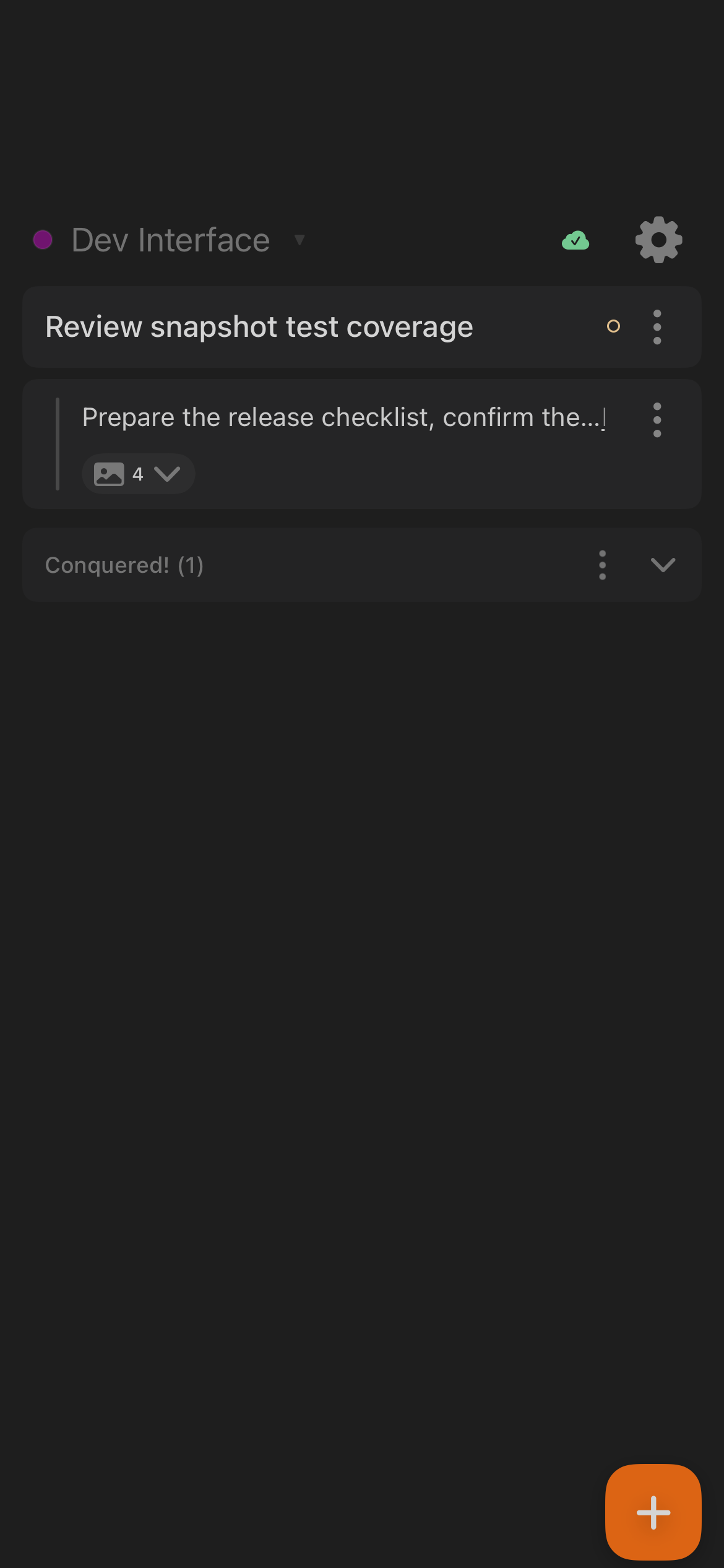
Thy Quill is the mobile notepad and workspace task list. "Conquered" means completed.
| Feature |
Android |
iOS |
Notes |
| Workspace note list |
✓ |
✓ |
Both show active notes for the selected workspace. |
| Add note item |
✓ |
✓ |
The primary add action opens the note-entry flow. |
| Inline edit |
✓ |
✓ |
Existing note text can be edited in place. |
| Nested note hierarchy |
✓ |
✓ |
Indent and outdent controls support structured notes, up to three levels deep on both platforms. |
| Reorder notes |
✓ |
✓ |
Long-press or drag behavior is platform-native. |
| Mark completed |
✓ |
✓ |
Completed items move into the conquered/done area. The toast reads "Item conquered!" on both platforms. |
| Undo completion |
✓ |
✓ |
Recently conquered items can be restored. |
| Clear completed |
✓ |
✓ |
Completed items can be cleared. |
| Copy completed |
✓ |
✓ |
Done/conquered text can be copied to the clipboard. |
| File attachments |
✓ |
✓ |
A note can carry up to ten attached files on both platforms. |
| Attachment preview/open/remove |
✓ |
✓ |
Platform pickers and viewers differ, but the attachment model is shared. |
| Bound document chips |
✓ |
✓ |
Notes linked to desktop documents show file chips. |
| Open document on desktop |
✓ |
✓ |
Bound files can be sent back to desktop when relay is available. |
| Markdown document links |
✓ |
✓ |
Links to known desktop files can open the matching Scroll. |
| Conflict recovery |
✓ |
✓ |
Both preserve a kept local version when note sync conflicts occur. |
| Dictation in note input |
✓ |
✓ |
Microphone dictation can fill note text. |
| Android |
iOS |
 |
 |
| Android Thy Quill. |
iOS Thy Quill. |
| Android |
iOS |
 |
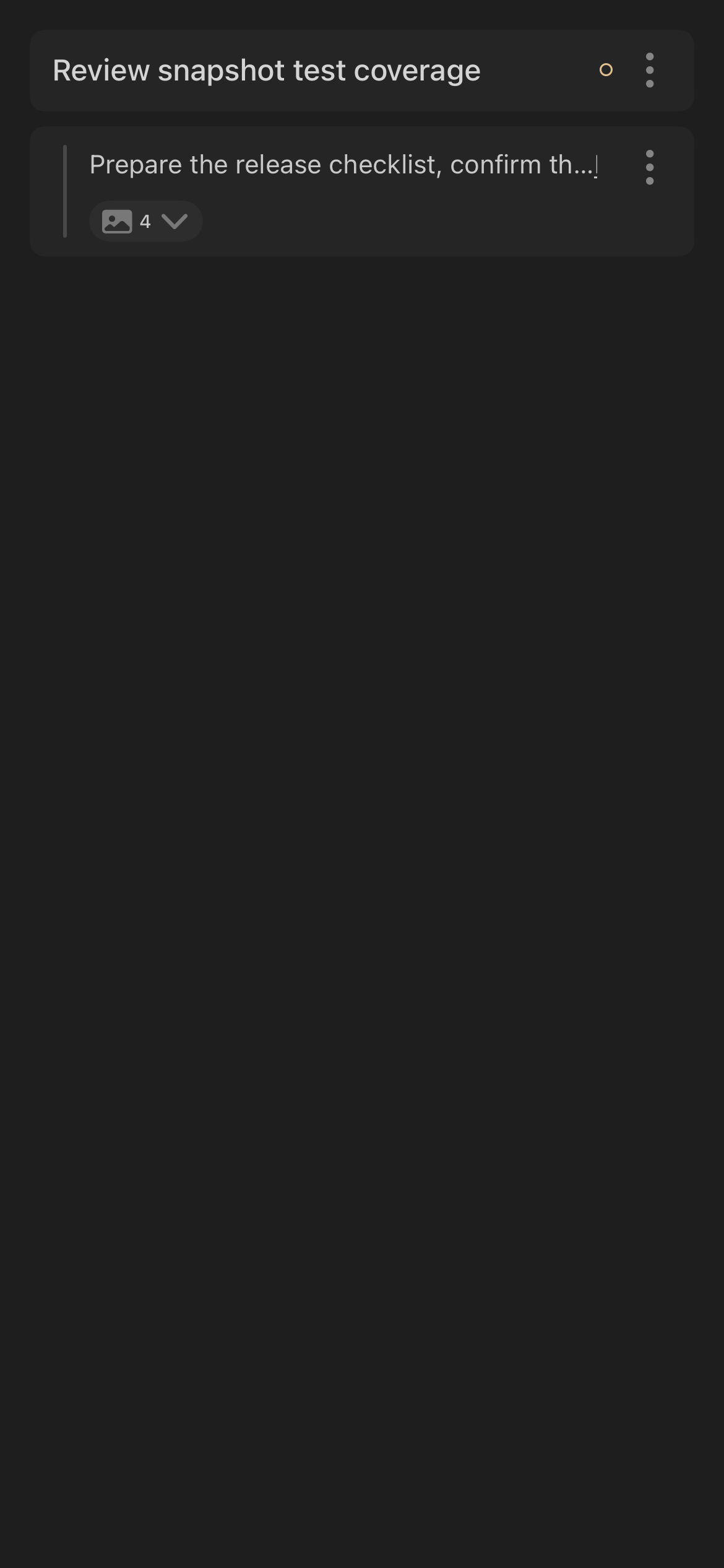 |
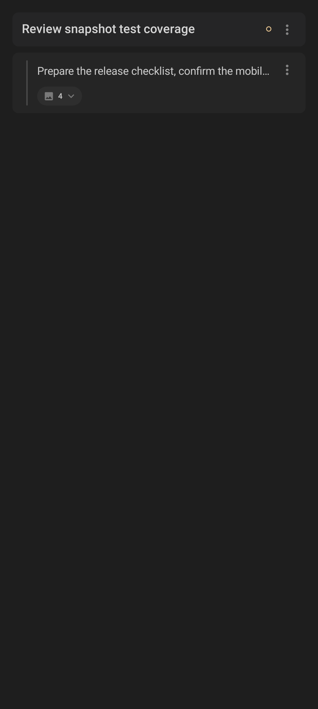
| A parent note with an indented child; the child carries an image-attachment count chip and a per-row overflow menu. |
iOS renders the same nesting, attachment chip, and overflow menu with native controls. |
Minions are desktop agent sessions shown and steered from mobile.
| Feature |
Android |
iOS |
Notes |
| Agent session list/pager |
✓ |
✓ |
Both let users move between active agent sessions. |
| Workspace filter |
✓ |
✓ |
Sessions can be scoped to the selected workspace. |
| Switch active agent |
✓ |
✓ |
Users can move focus between sessions. |
| Session status chips |
✓ |
✓ |
Running, idle, disconnected, and related states are surfaced visually. |
| Terminal output |
✓ |
✓ |
Both render command/agent output with terminal-oriented styling. |
| ANSI output styling |
✓ |
✓ |
Terminal colors/styles are interpreted for readability. |
| Send input to agent |
✓ |
✓ |
Users can send follow-up prompts or command input. |
| Retry input |
✓ |
✓ |
Failed input can be retried. |
| Input history |
✓ |
✓ |
Recent prompts can be reused. |
| Dictated prompt input |
✓ |
✓ |
The microphone flow can insert spoken text into the prompt box. |
| Image attachments |
✓ |
✓ |
Both offer three sources — photo gallery, live camera capture, and clipboard paste. Android uses the system photo picker and Android clipboard; iOS uses PhotosPicker, camera capture, and the pasteboard ("Paste from the scroll"). |
| Summon new session |
✓ |
✓ |
The add/summon action starts or requests a new agent session. |
| Local/cloud execution target |
✓ |
✓ |
Available targets depend on the relay and account configuration. |
| Voice Mode |
✓ |
✓ |
Both platforms implement voice-mode controls; the standalone screenshot set currently includes only iOS. |
| Scheduled-agent handoff |
✓ |
✓ |
Scheduled runs can be opened as related agent sessions. |
| Android |
iOS |
 |
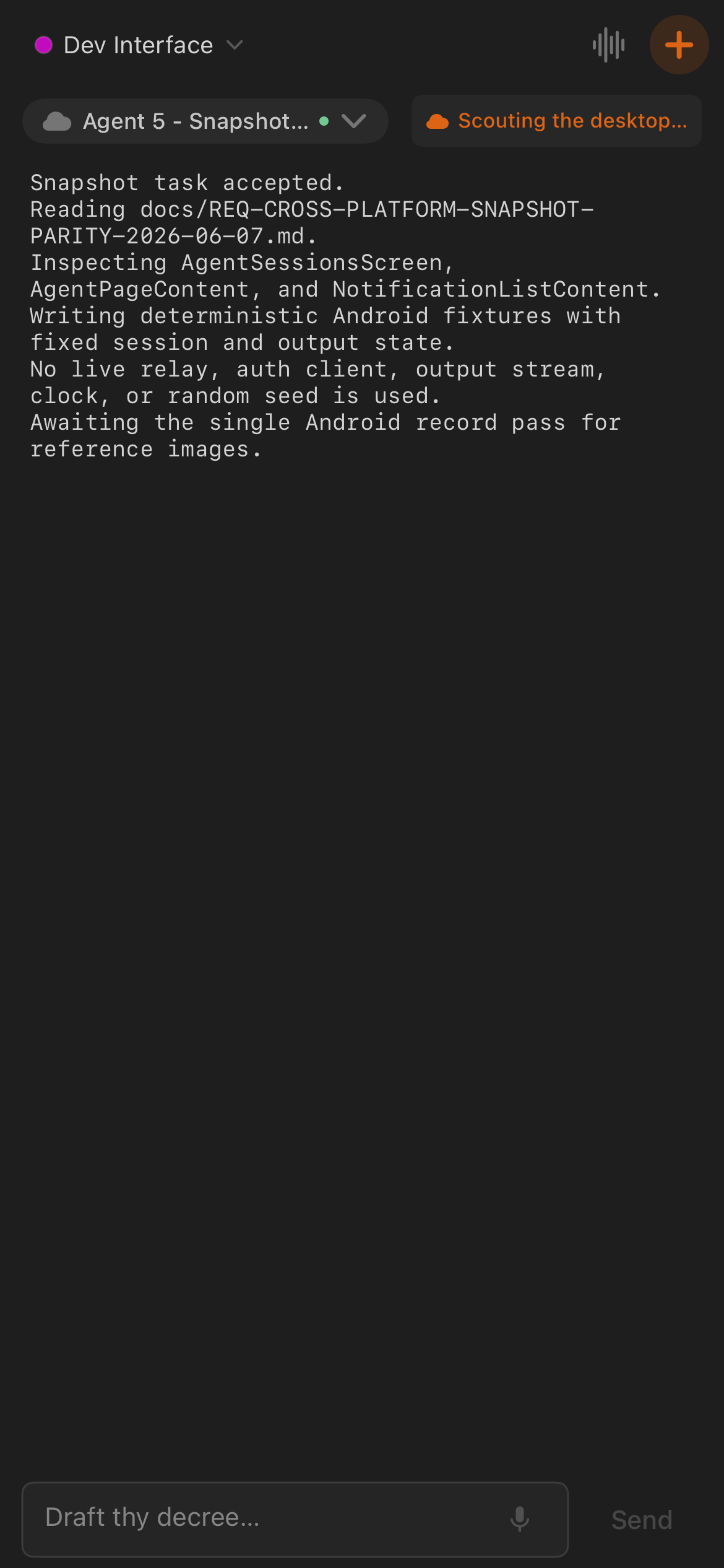 |
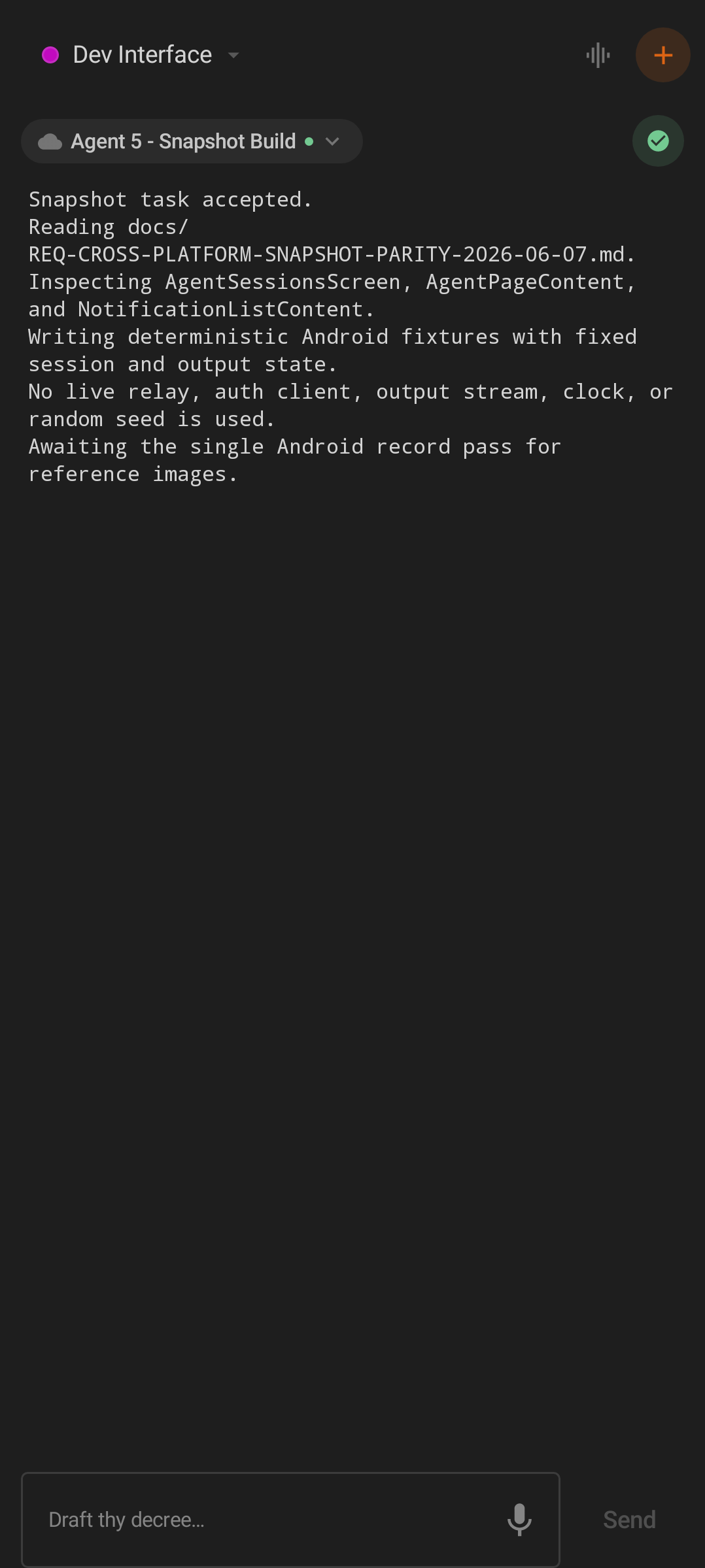
| Android Minions. |
iOS Minions. |
| iOS standalone Voice Mode screenshot |
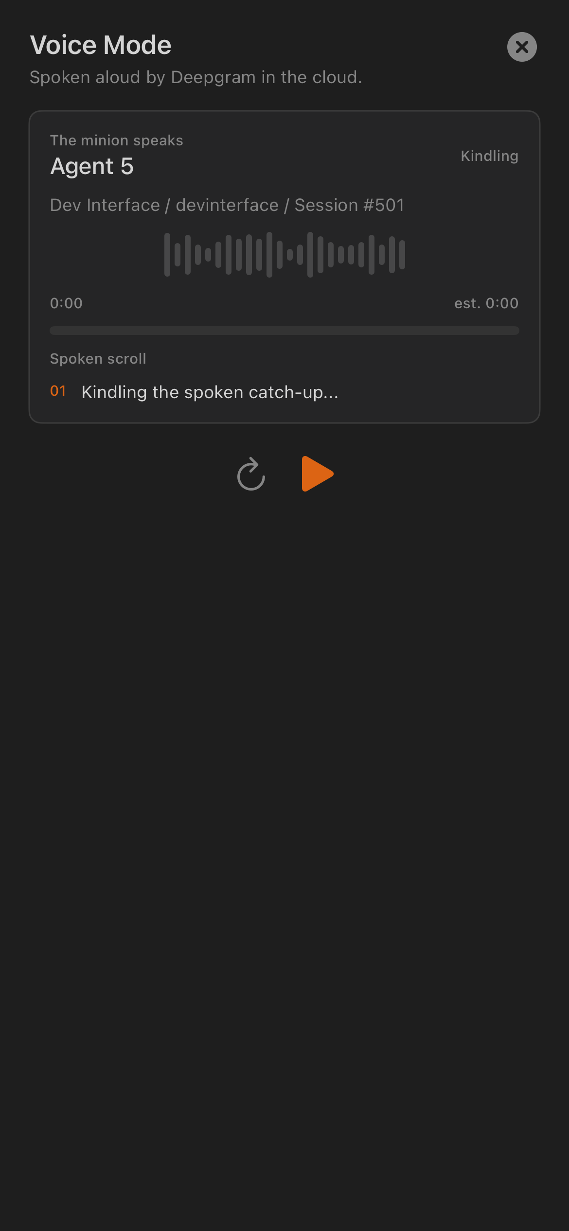 |
| The dedicated Voice Mode capture is iOS-only in this screenshot set, although the feature is implemented on both platforms. |
Scrolls are files currently open on desktop.
| Feature |
Android |
iOS |
Notes |
| Open-file list |
✓ |
✓ |
Both list desktop files exposed by the relay. |
| Search/filter |
✓ |
✓ |
Users can filter the open-file list. |
| Manual refresh |
✓ |
✓ |
Both can request updated desktop file state. |
| Automatic polling |
✓ |
✓ |
Relay-backed state refreshes about every five seconds while the screen is open, on both platforms. |
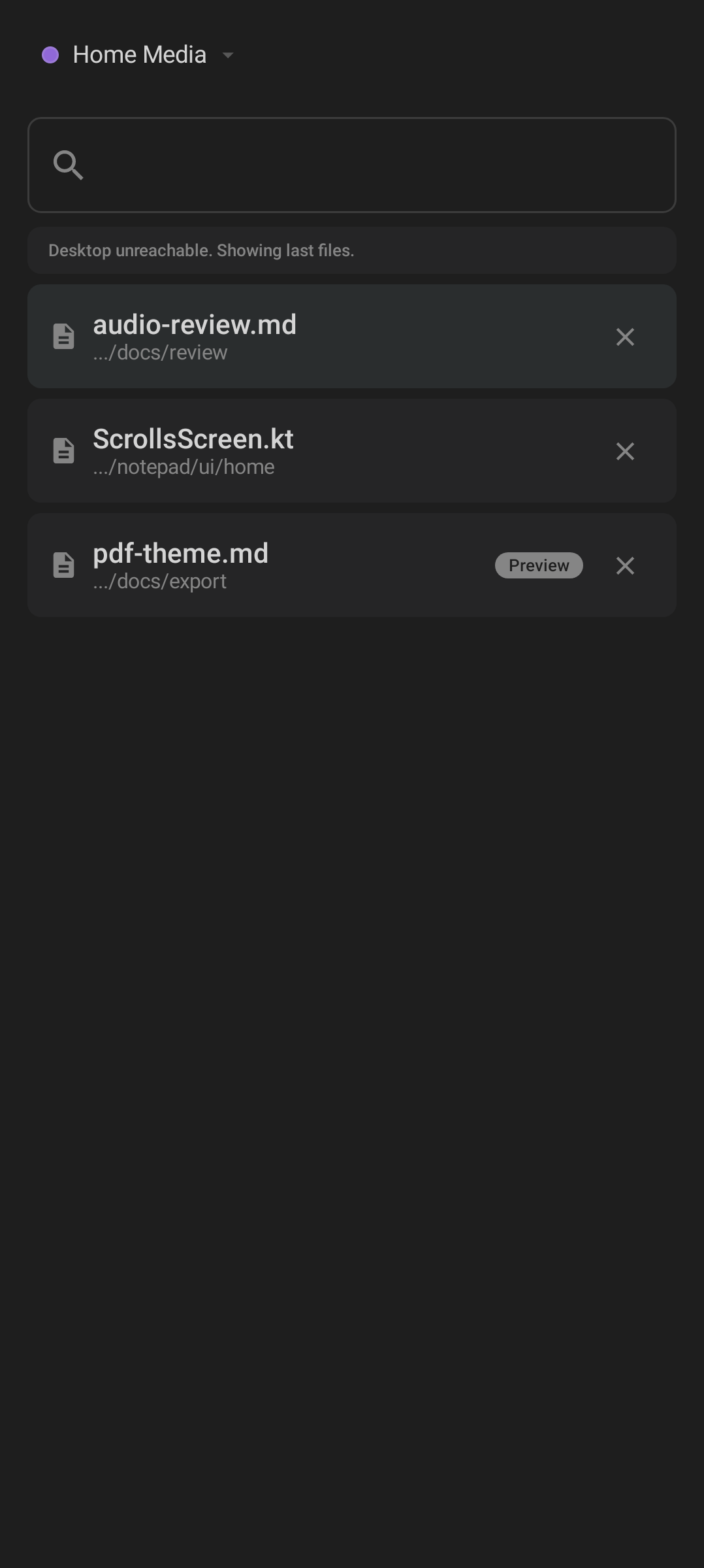
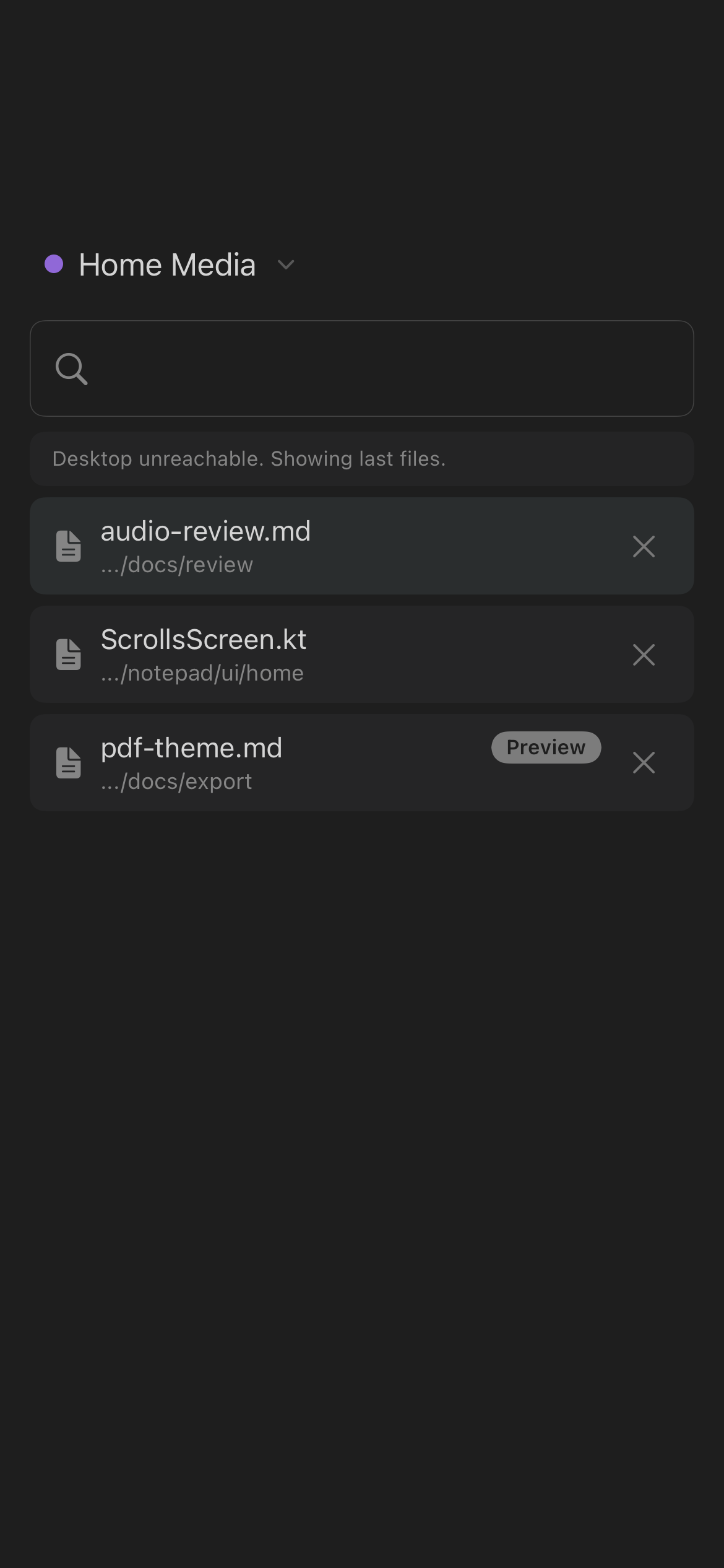
| Desktop-unreachable banner |
✓ |
✓ |
Both make stale or cached state explicit when desktop is offline. |
| File preview/status badges |
✓ |
✓ |
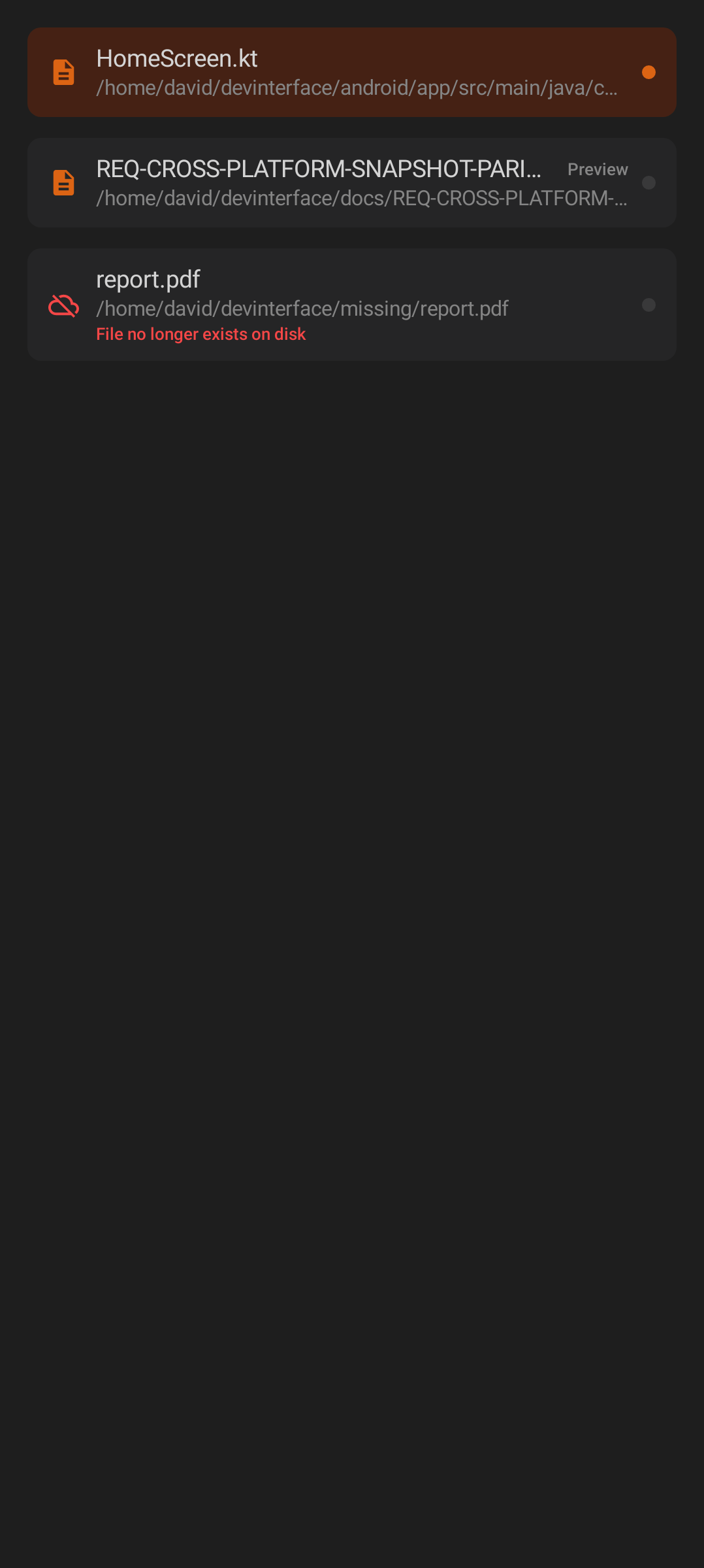
Both show a "Preview" badge on preview-only files and a red offline/missing state (for example "File no longer exists on disk"). |
| Close open file |
✓ |
✓ |
Android exposes only per-row close controls; iOS adds a long-press multi-select mode for batch close, so iOS is a superset here. |
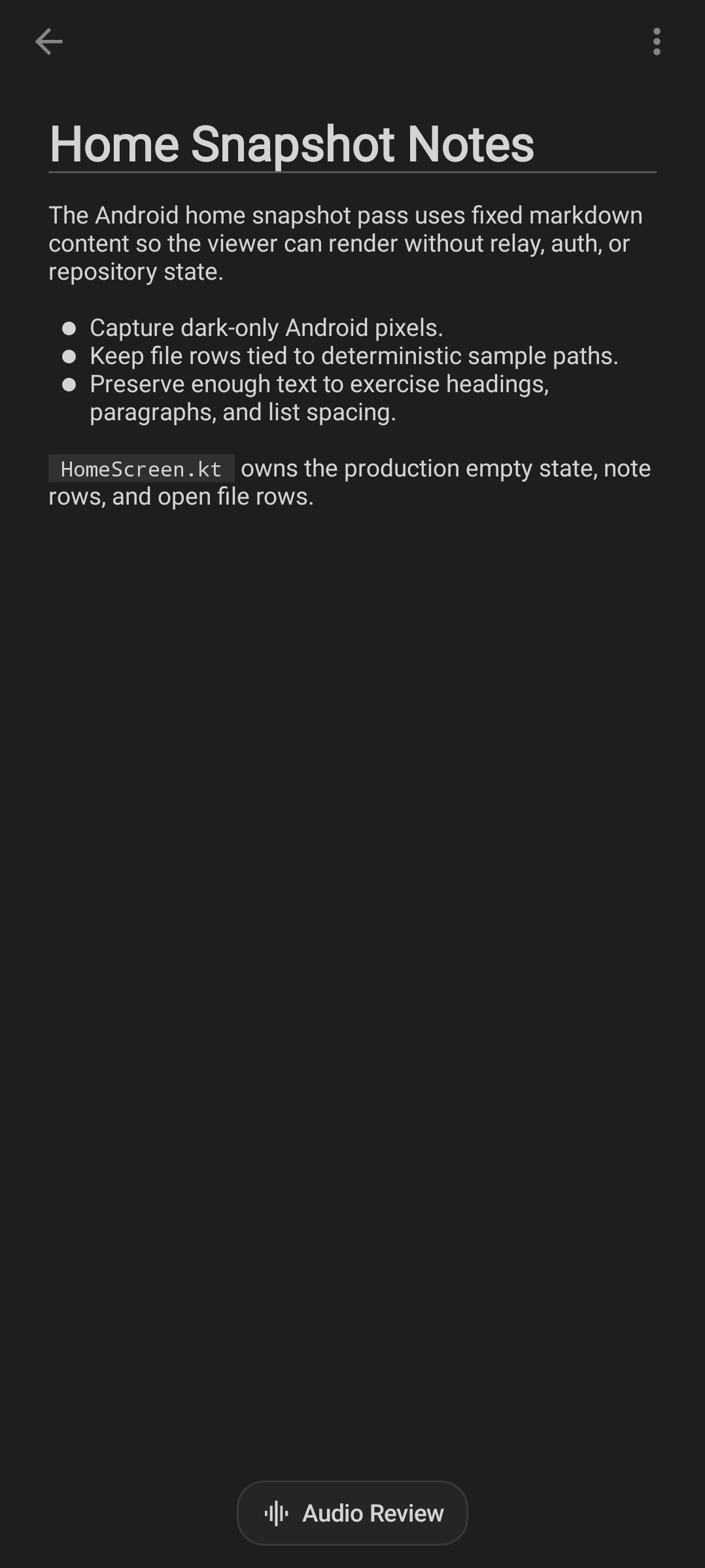
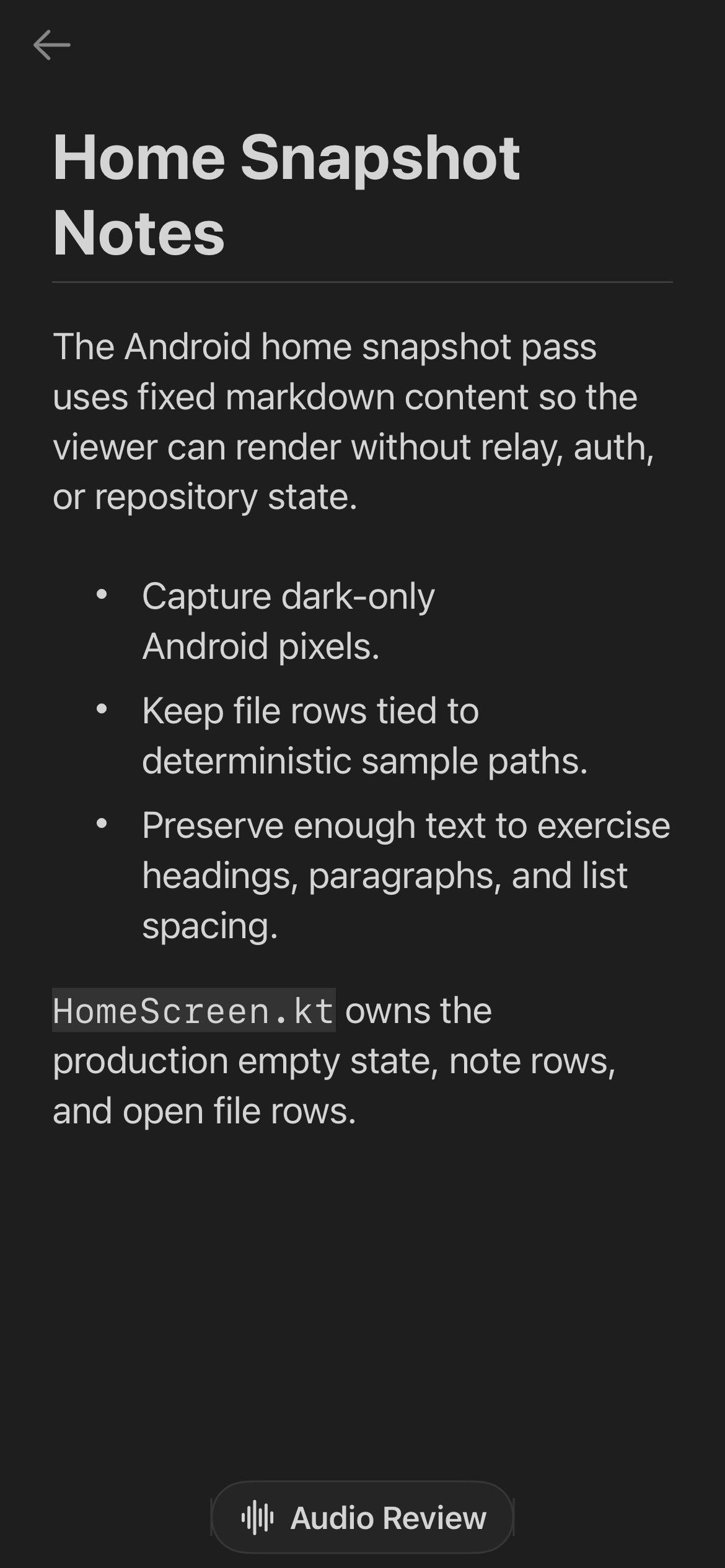
| File viewer |
✓ |
✓ |
Both open a read-only mobile viewer for supported content. |
| Markdown rendering |
✓ |
✓ |
Rendered as formatted content — Android uses a native Markdown renderer, iOS renders through an in-app web view. |
| HTML/plain text handling |
✓ |
✓ |
Non-Markdown content falls back to readable text handling. |
| Truncation and error states |
✓ |
✓ |
Large files are truncated and fetch failures show explicit error states. |
| PDF export |
✓ |
✓ |
Both export Markdown-style content to PDF. |
| PDF theme picker |
✓ |
✓ |
Three document themes — Dark, Warm, Light — on both. Android shows an in-app dialog then a post-export "View PDF / Share PDF" choice; iOS shows a native confirmation dialog and goes straight to the iOS share sheet. |
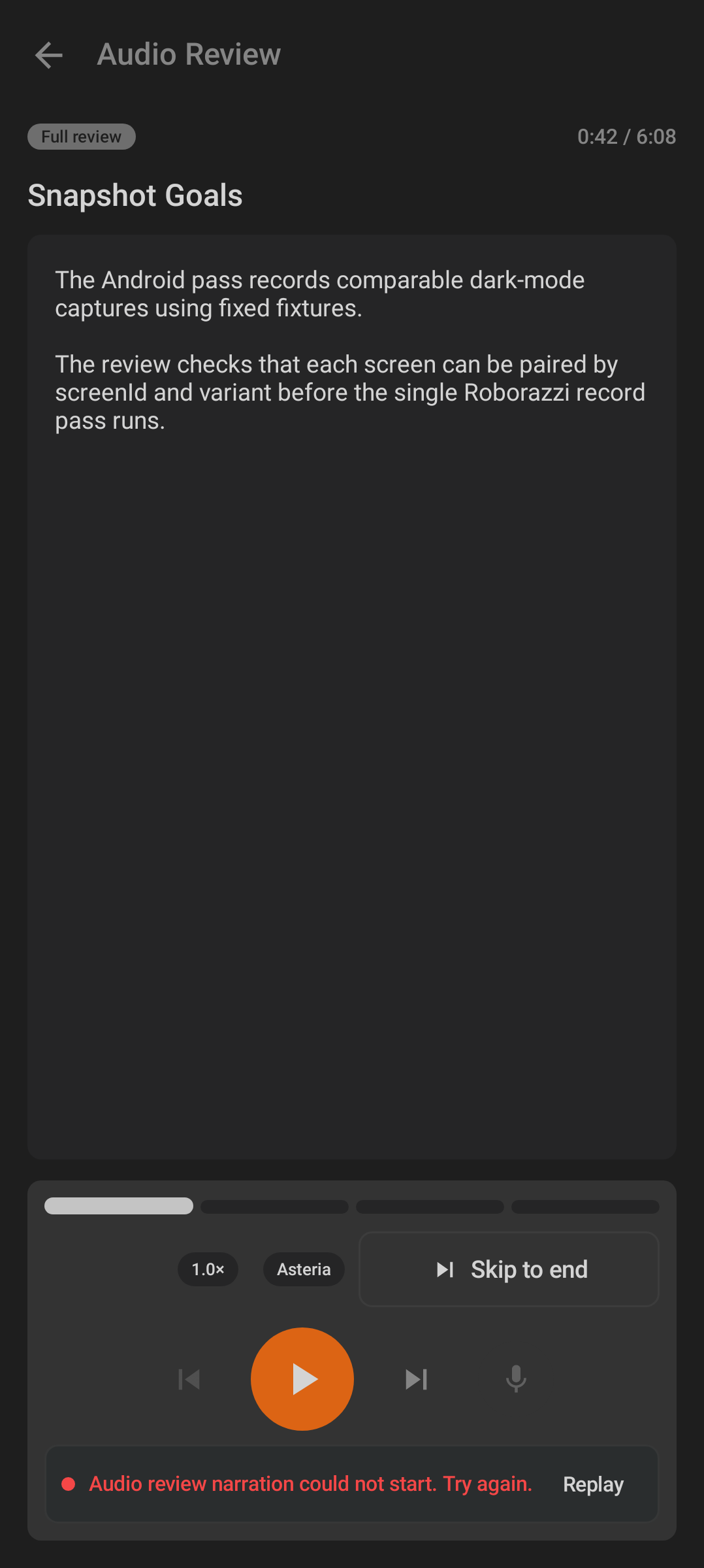
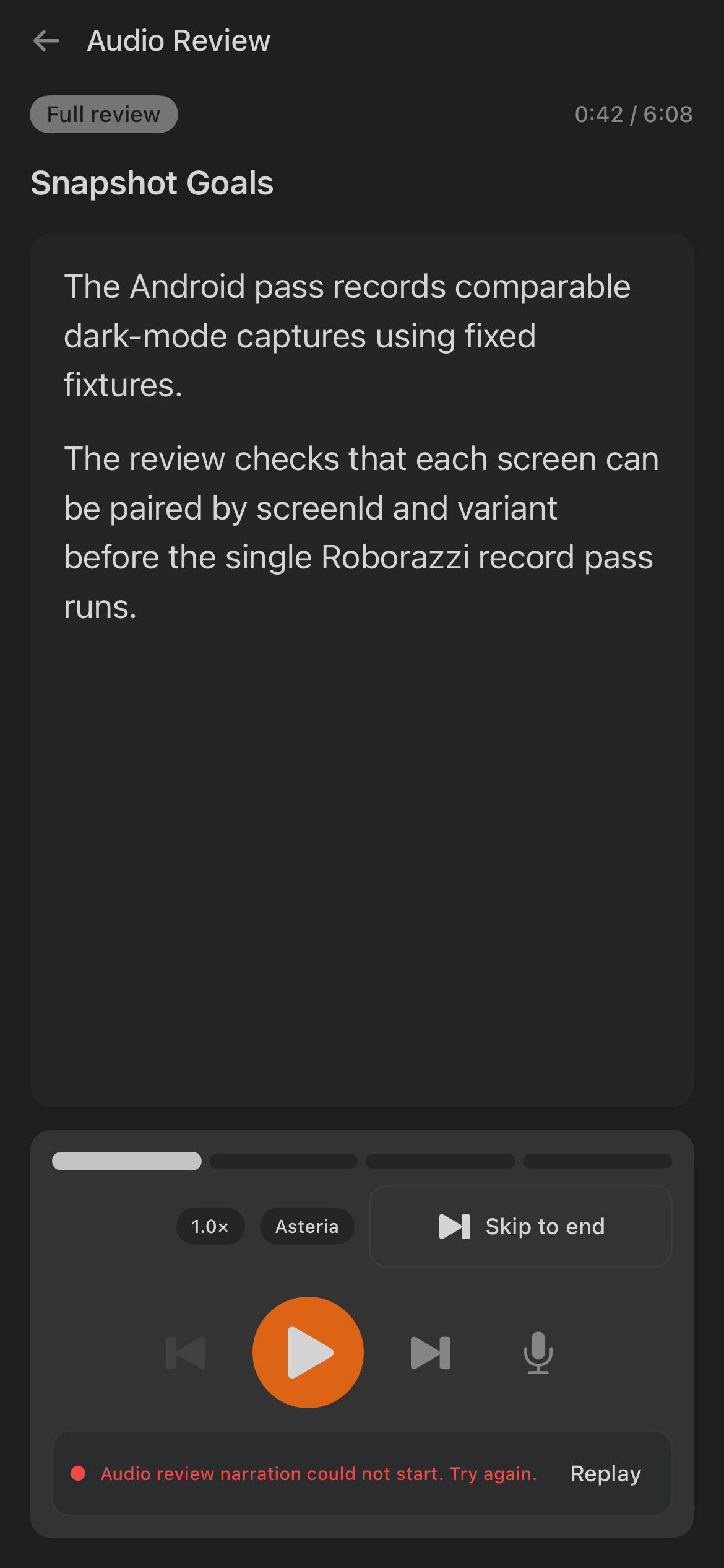
| Audio Review |
✓ |
✓ |
Both can start a spoken review/summarization flow for a file. |
| Review summary |
✓ |
✓ |
Both show generated review output with status and retry behavior. |
| Review feedback |
✓ |
✓ |
Users can send review feedback from the mobile review surface. |
| Android |
iOS |
 |
 |
| Android Scrolls. |
iOS Scrolls. |
| Android |
iOS |
 |
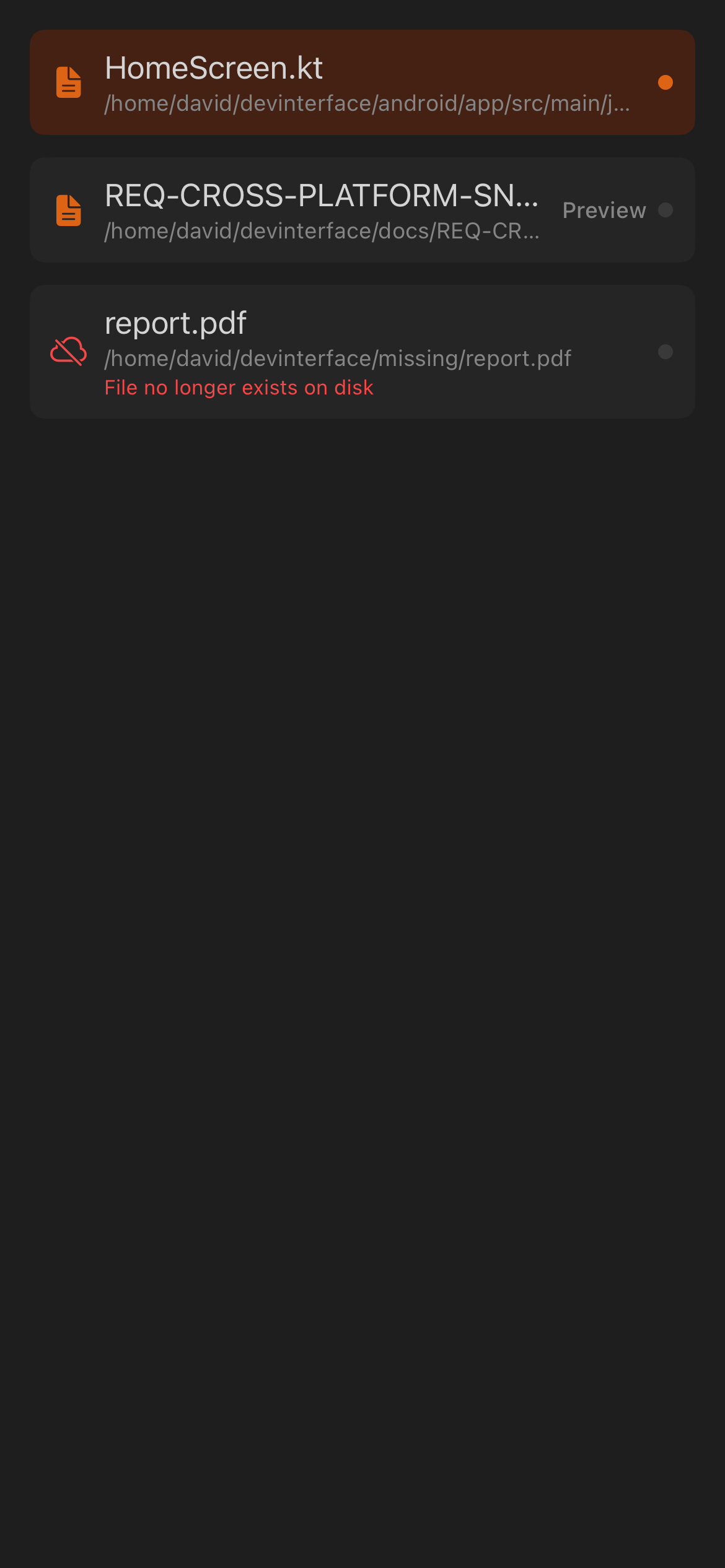 |
| Open-file rows carry a path subtitle and a status mark: the top row is selected (fire dot), the middle row is preview-only ("Preview" badge), and the bottom row is missing on disk (red). |
iOS uses the same row anatomy and status states. |
| Android |
iOS |
 |
 |
| Android file viewer. |
iOS file viewer. |
| Android |
iOS |
 |
 |
| Android Audio Review. |
iOS Audio Review. |
| iOS standalone export screenshot |
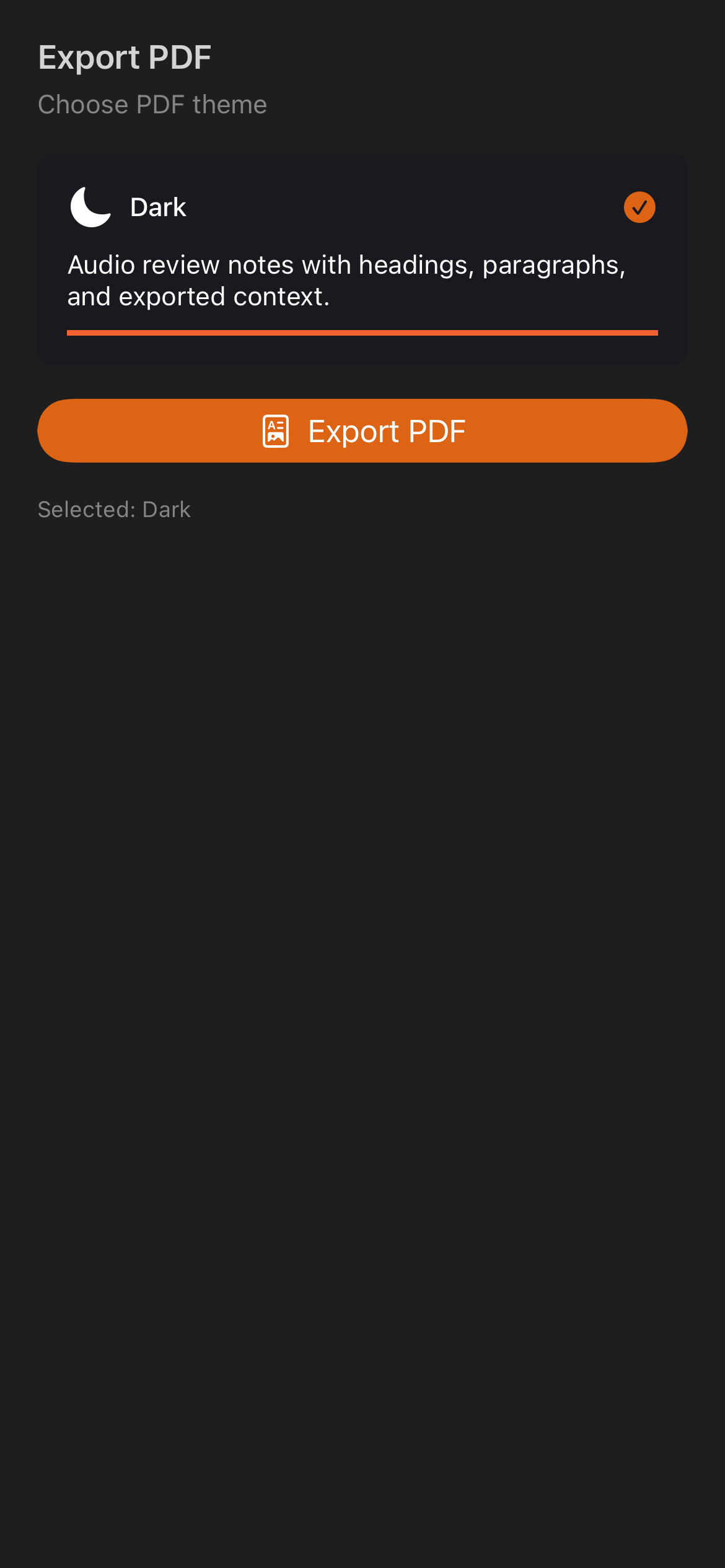 |
| The dedicated export-PDF theme picker capture is iOS-only in this screenshot set, although the picker is implemented on both platforms. |
Rituals are scheduled agent tasks.
| Feature |
Android |
iOS |
Notes |
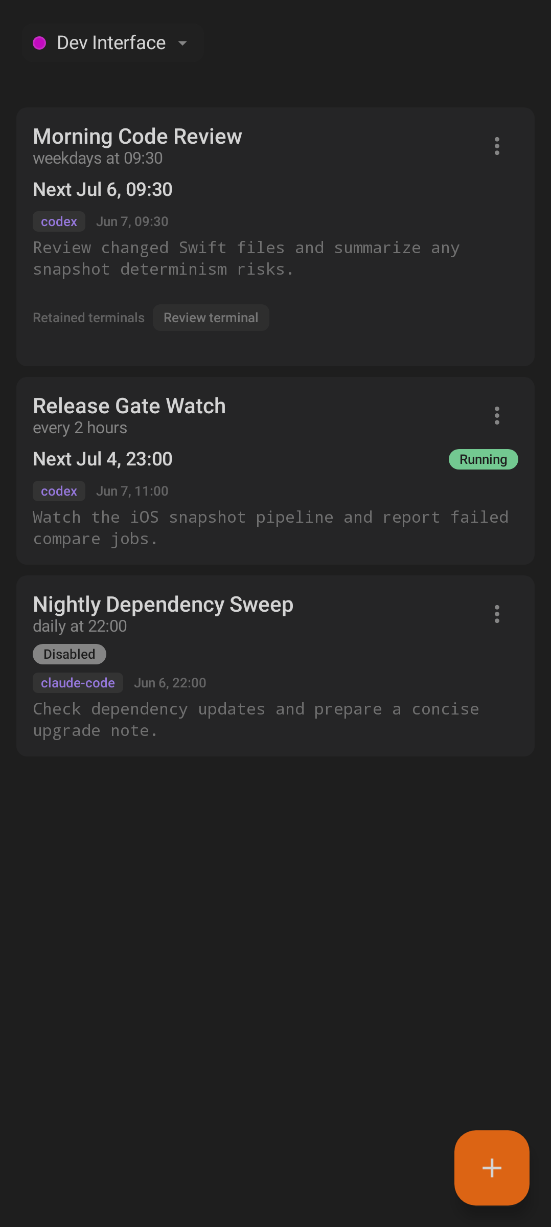
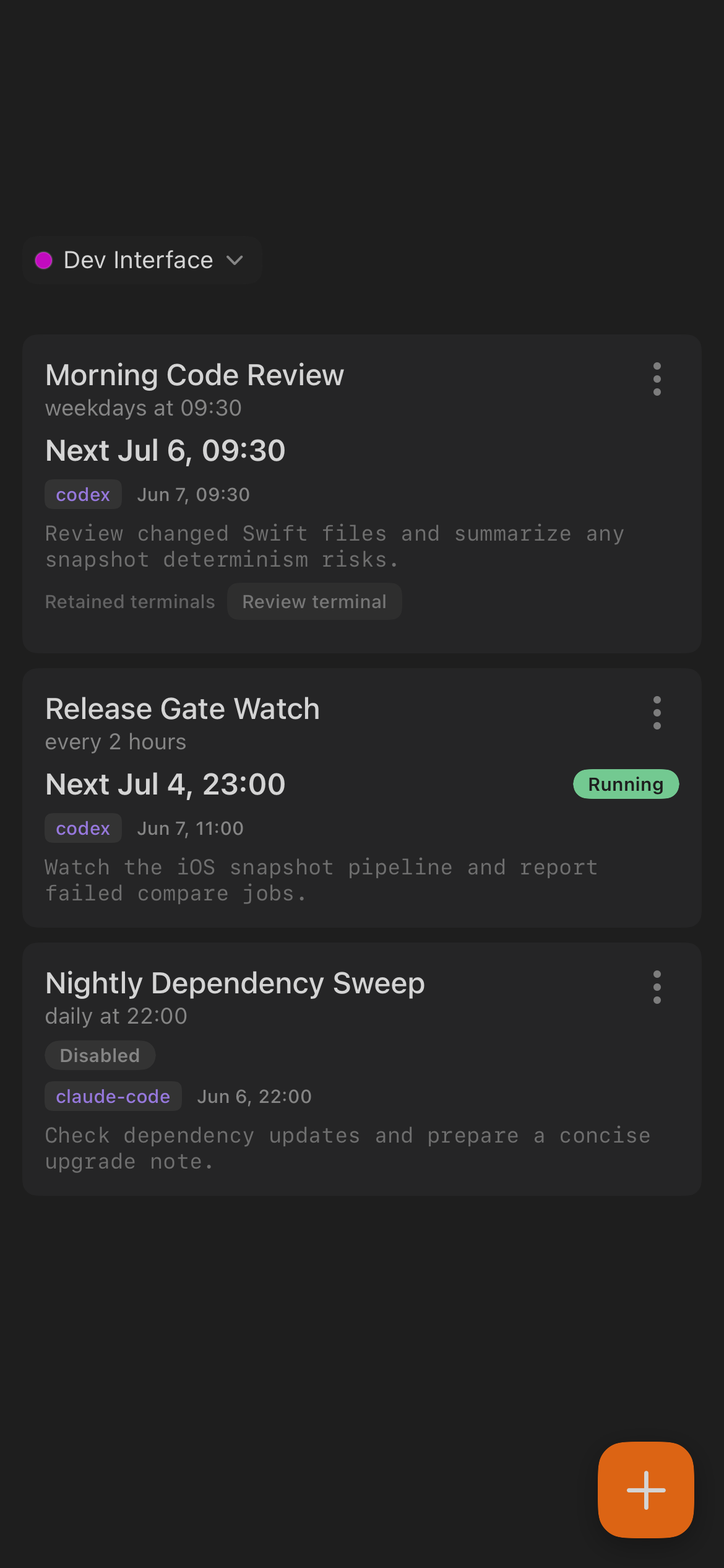
| Scheduled task list |
✓ |
✓ |
Both show configured scheduled work. |
| Create task |
✓ |
✓ |
The add action opens task creation. |
| Edit task |
✓ |
✓ |
Existing task details can be changed. |
| Delete task |
✓ |
✓ |
Tasks can be removed. |
| Enable/disable task |
✓ |
✓ |
A disabled Ritual will not run until re-enabled. |
| Dispatch now |
✓ |
✓ |
Users can manually run a task outside its schedule. |
| Halt running task |
✓ |
✓ |
Running scheduled work can be stopped. |
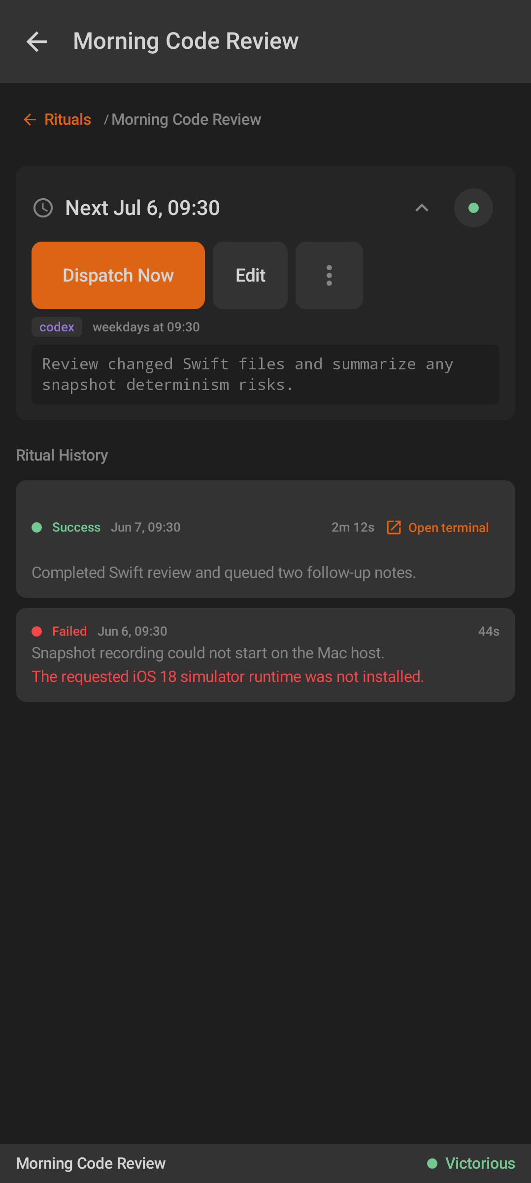
| Task detail |
✓ |
✓ |
Detail views show status, schedule, prompt, and run controls. |
| Run history |
✓ |
✓ |
Past runs are listed with outcome/state. |
| Running scheduled terminal |
✓ |
✓ |
Active scheduled-agent output can be followed from mobile. |
| Open finished run agent |
✓ |
✓ |
Completed scheduled runs can link back to their agent session. |
| Notification deep links |
✓ |
✓ |
Related Omens can jump to the task, run, or agent context. |
| Android |
iOS |
 |
 |
| Android Rituals list. |
iOS Rituals list. |
| Android |
iOS |
 |
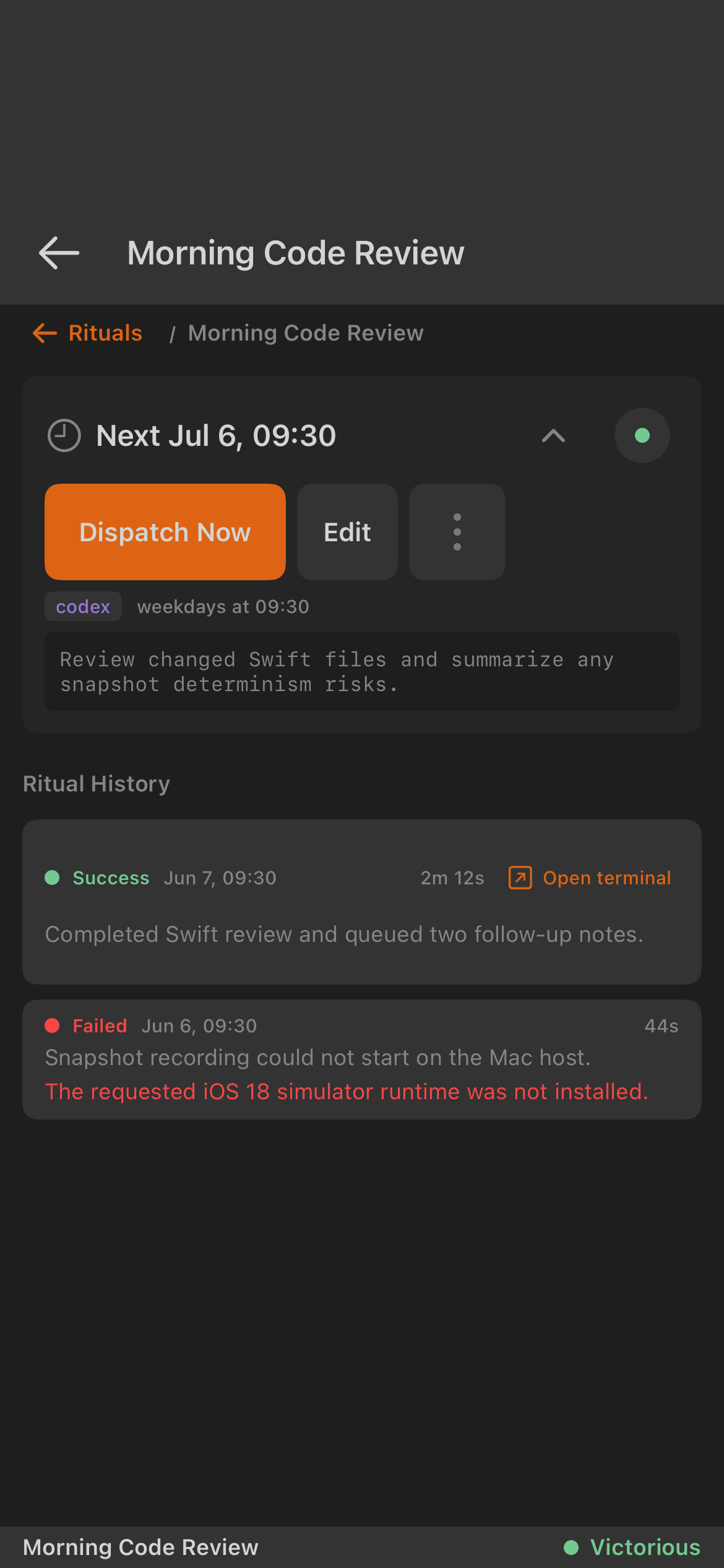 |
| Android Ritual detail. |
iOS Ritual detail. |
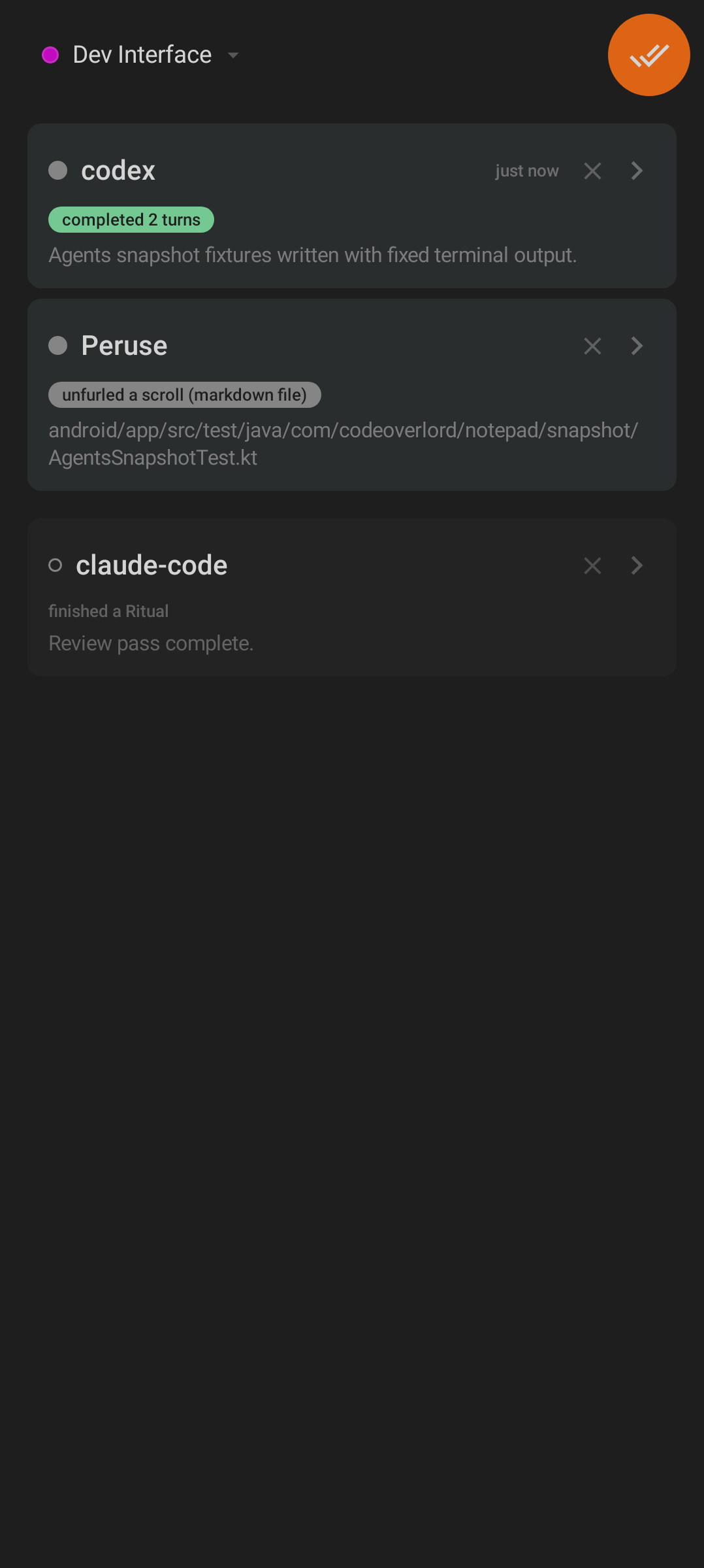
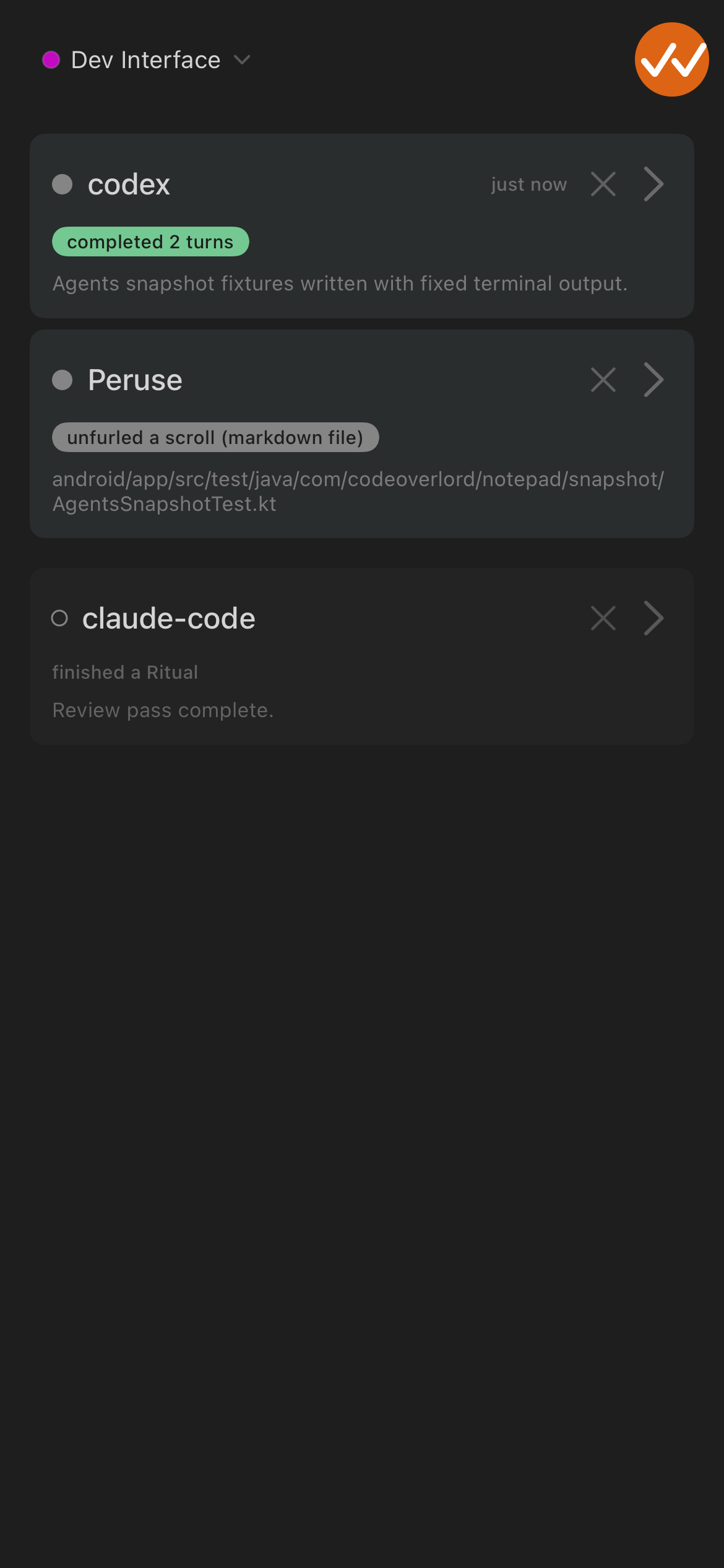
Omens are notifications about agent activity, files, and scheduled work.
| Feature |
Android |
iOS |
Notes |
| Notification list |
✓ |
✓ |
Both show Omens in a dedicated mobile area. |
| Unread/read state |
✓ |
✓ |
Unread activity is visually distinct and can update navigation badges. |
| Empty state |
✓ |
✓ |
Both handle a quiet inbox. |
| File-opened deep link |
✓ |
✓ |
File-related Omens can open the matching Scroll. |
| Agent-session deep link |
✓ |
✓ |
Agent-related Omens can jump to Minions. |
| Scheduled-task deep link |
✓ |
✓ |
Scheduled-task Omens can jump to Rituals. |
| Local notification integration |
✓ |
✓ |
Mobile notification behavior depends on platform permission settings. |
| Android |
iOS |
 |
 |
| Android Omens. |
iOS Omens. |
| Feature |
Android |
iOS |
Notes |
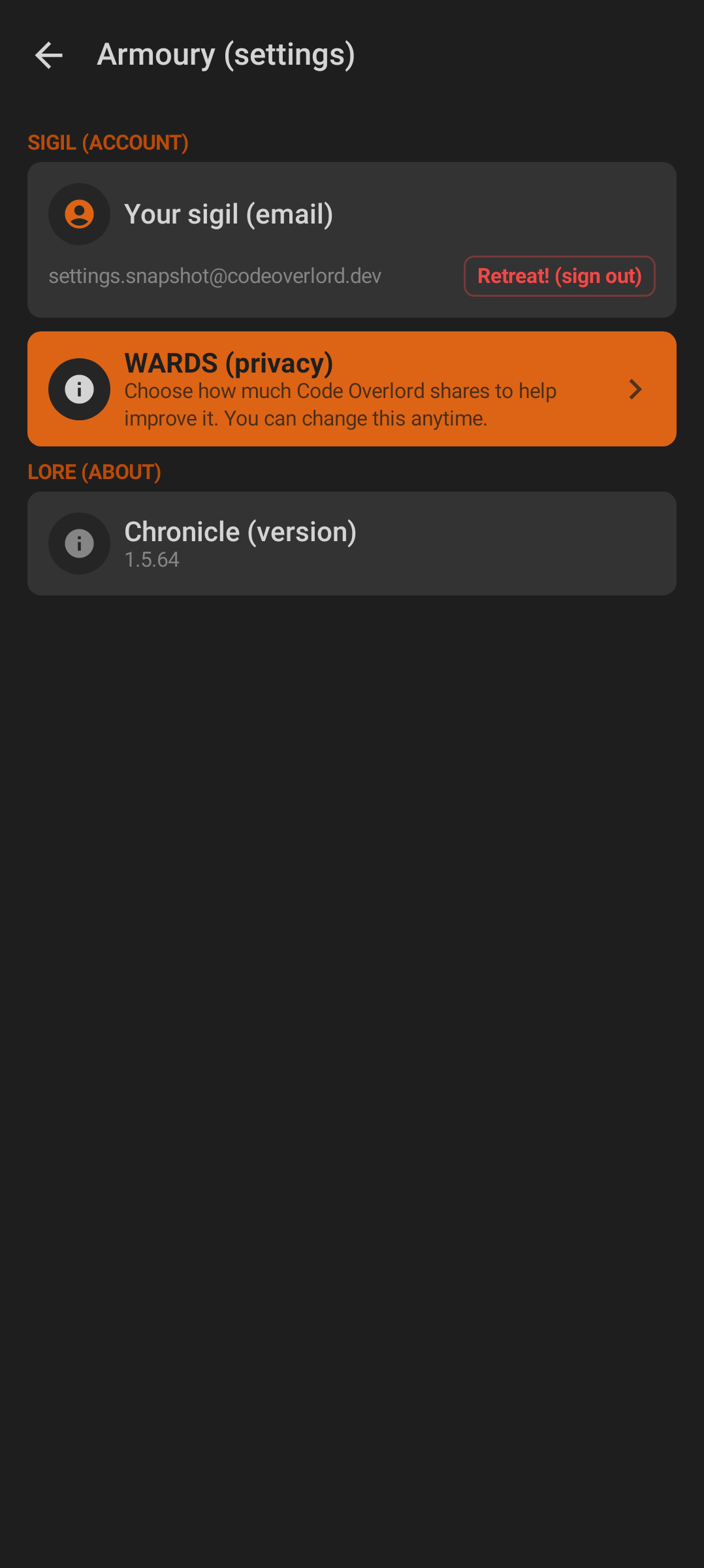
| Account identity |
✓ |
✓ |
Settings show the signed-in sigil/account identity. |
| Sign out |
✓ |
✓ |
Both include an account exit action. |
| Privacy profiles |
✓ |
✓ |
WARDS privacy controls expose shared privacy levels. |
| Advanced telemetry view |
✓ |
✓ |
Both include advanced telemetry inspection/reset/export surfaces. |
| About/version |
✓ |
✓ |
Version and app information are available in Armoury. |
| Realm/environment switch |
Build/config |
Build/config |
Visible when the build exposes bridge realm controls. |
| Feedback composer |
✓ |
✓ |
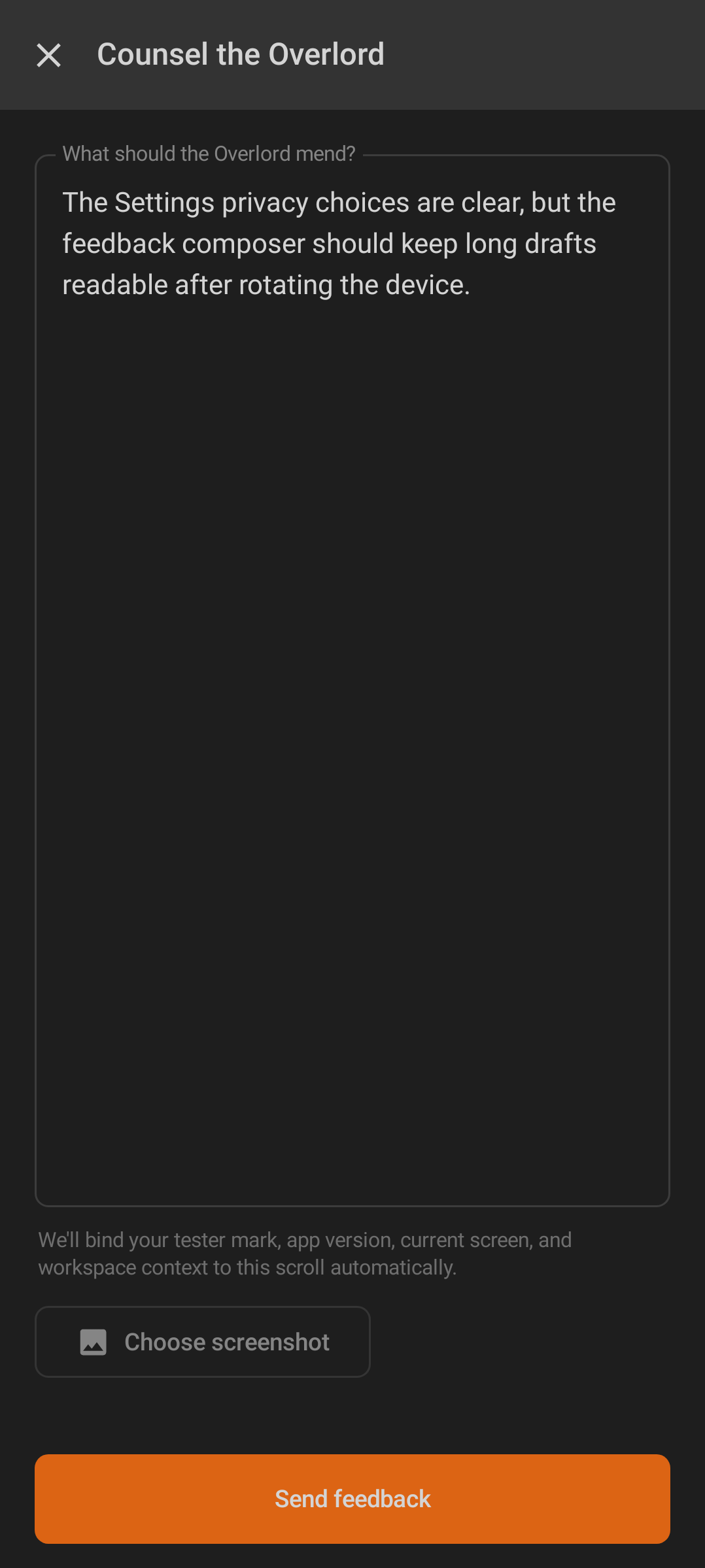
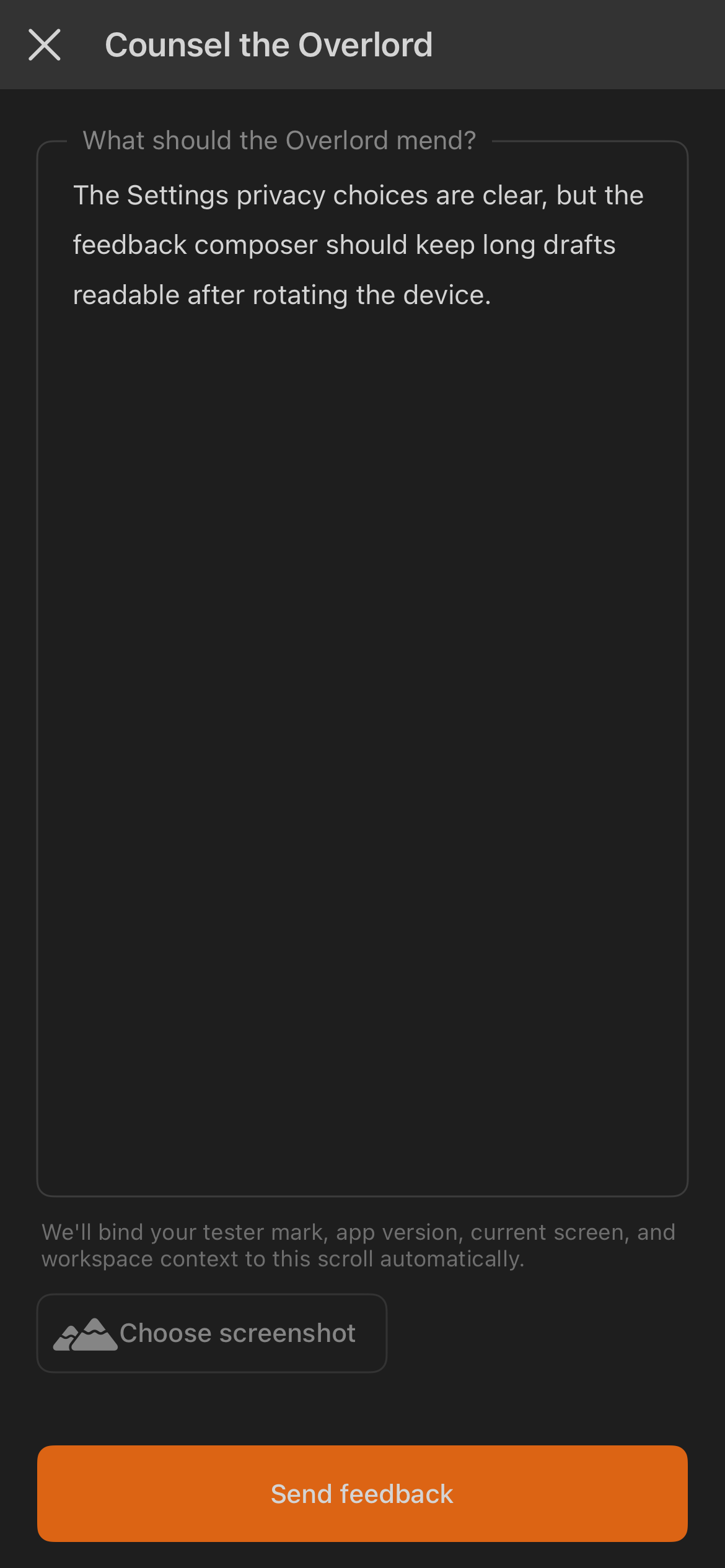
Users can send text feedback. |
| Screenshot attachment |
✓ |
✓ |
Feedback can include a screenshot when the platform grants access. |
| Android |
iOS |
 |
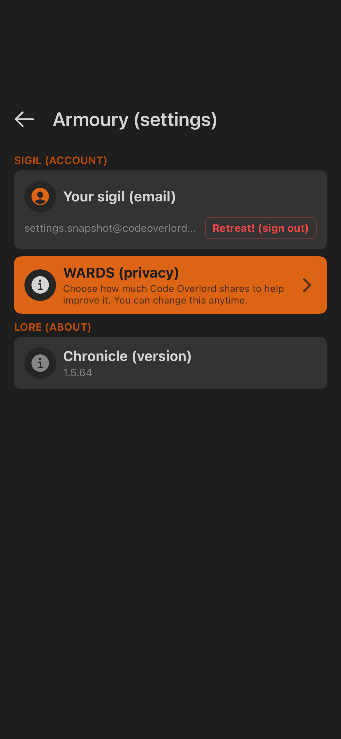 |
| Android Armoury. |
iOS Armoury. |
| Android |
iOS |
 |
 |
| Android feedback composer. |
iOS feedback composer. |
| Feature |
Android |
iOS |
Notes |
| Shared dark visual language |
✓ |
✓ |
Both use the same product palette and high-contrast dark surfaces. |
| Primary fire action styling |
✓ |
✓ |
The main action on a screen uses the warm fire accent. |
| Status dots and pills |
✓ |
✓ |
Success, warning, error, idle, and workspace states use consistent colors. |
| Identity rows |
✓ |
✓ |
Account, workspace, and entity rows share icon/text/status structure. |
| Dictation button |
✓ |
✓ |
Microphone controls use the same listening/processing/error model. |
| Review summary pattern |
✓ |
✓ |
AI review results use the same structured summary surface. |
| FireText |
✓ |
✓ |
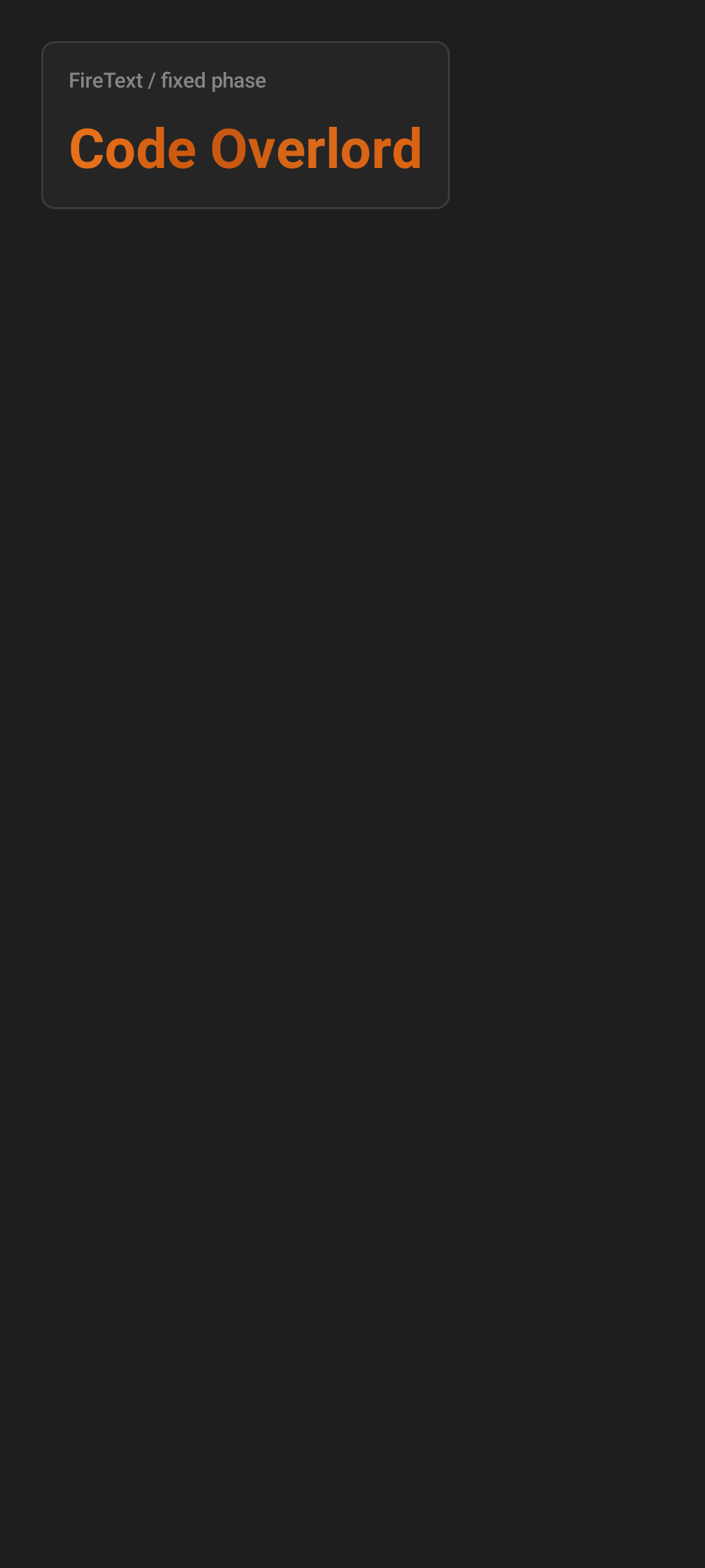
The wordmark's letters cycle through fire colors (ember → orange → bright) in a slow loop. Reserved for brand moments; never a status signal. |
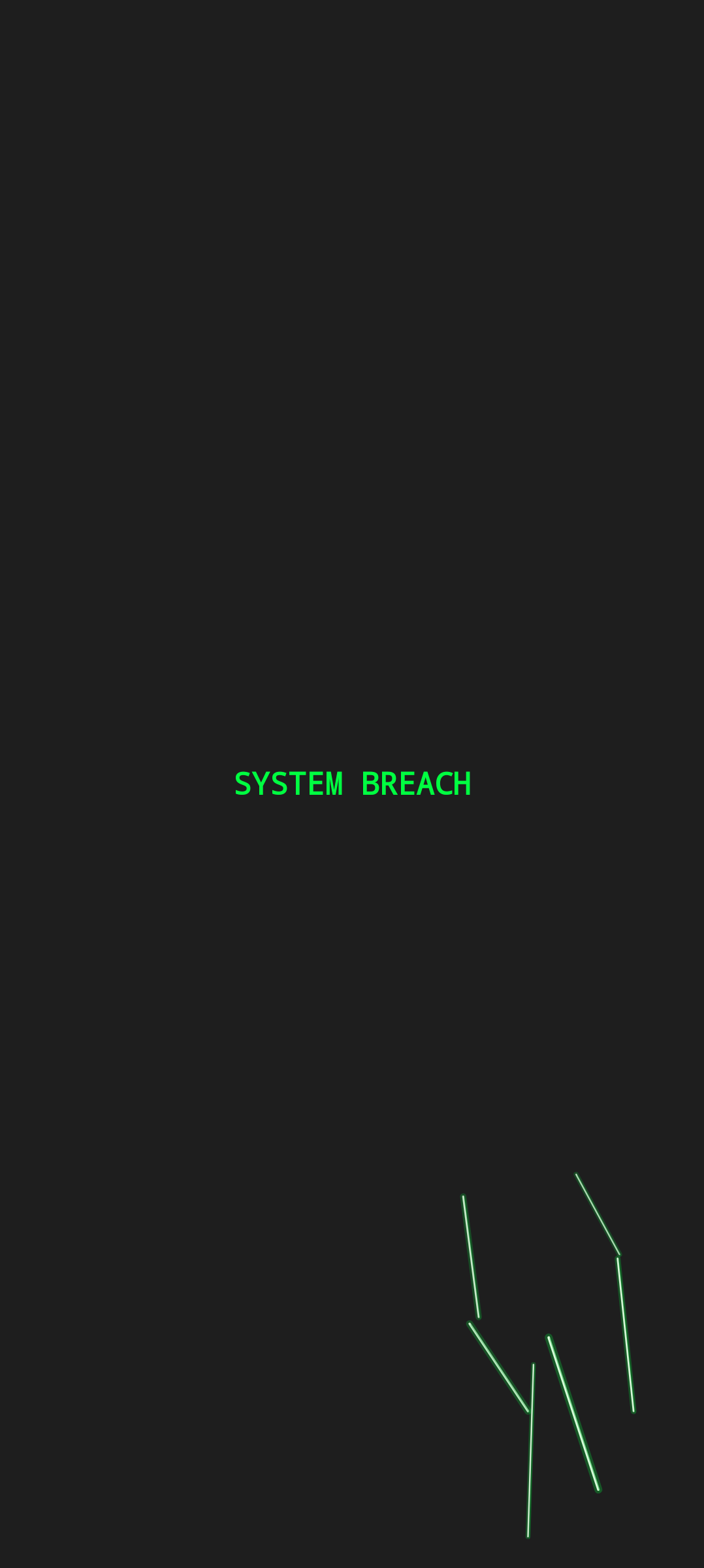
| Screen-crack overlay |
✓ |
✓ |
A theatrical Easter egg with fake "SYSTEM BREACH" crash taunts — not a real error or security state. Unlocked by tapping the Omens tab repeatedly. |
| Dragon's Gauntlet |
✓ |
✓ |
A hidden Flappy-Bird-style mini-game, unlocked by tapping the Omens tab about eight times (the screen "cracks" from ~4 taps, shatters at 8, then the game opens). |
| Android |
iOS |
 |
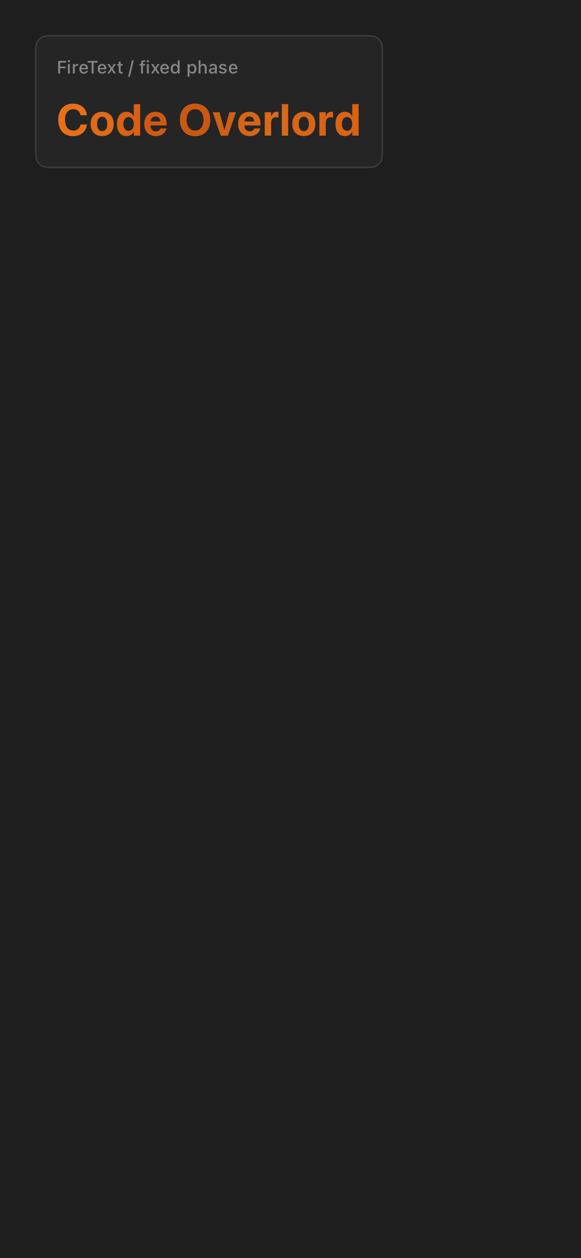 |
| Android FireText. |
iOS FireText. |
| Android |
iOS |
 |
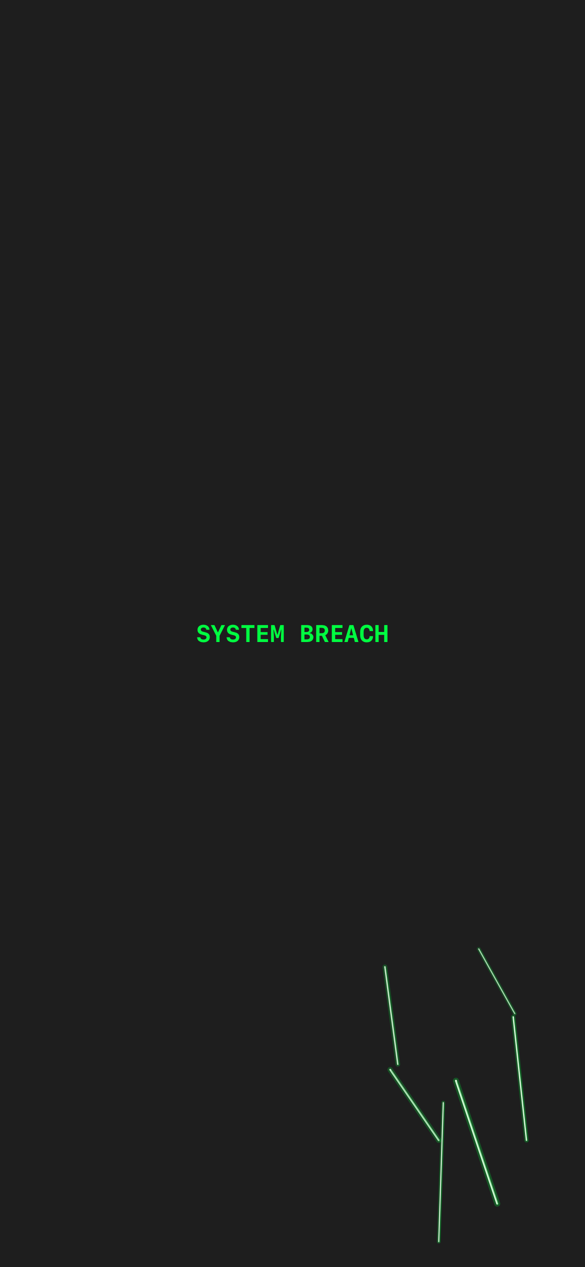 |
| Android screen-crack overlay. |
iOS screen-crack overlay. |
- Standalone Voice Mode capture: iOS only. Android Voice Mode is present in source and visible through Minions controls, but no dedicated Android Voice Mode screenshot was present in the provided pair set.
- Standalone export-PDF theme picker capture: iOS only. Android PDF theme selection is present in source, but no dedicated Android export-picker screenshot was present in the provided pair set.
- Onboarding quick tour: the quick-tour screen and its screenshot exist only for iOS, and even there it is not part of the shipping onboarding route (welcome → pairing/login). Treat the capture as a design artifact, not a screen most users will reach. Android has no quick-tour screen.
- Newly added paired captures in this section: the "Bind your stronghold" pairing/permission screen (
desktop-pairing-*), the nested note row with attachment chip (note-item-row-*), and the Scrolls open-file rows with Preview and missing-file states (open-file-row-*).
- Aside from the three iOS-only captures noted above, all paired overview/design screenshots used here have both Android and iOS captures in the curated asset folder.