Mobile Design Language
On this page
The Android and iOS apps share one visual system. The details are native to each platform, but the meaning is consistent: dark workspace surfaces for focus, fire-colored primary actions for the next important command, compact status marks for live state, and theatrical atmosphere effects for branded moments rather than error states.
The themed names are decorative labels over practical tools. Thy Quill is notes, Minions are agent sessions, Scrolls are open desktop files, Rituals are scheduled tasks, Omens are notifications, and Armoury is settings.
Theme System
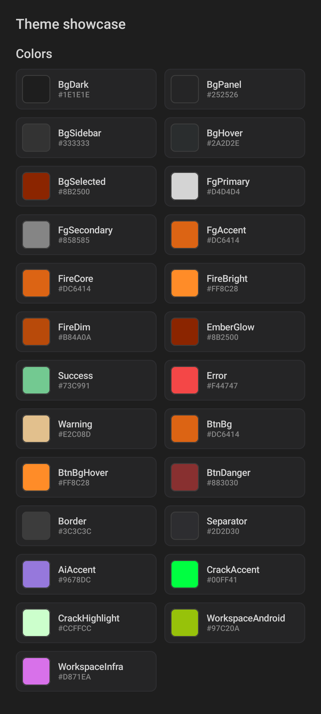
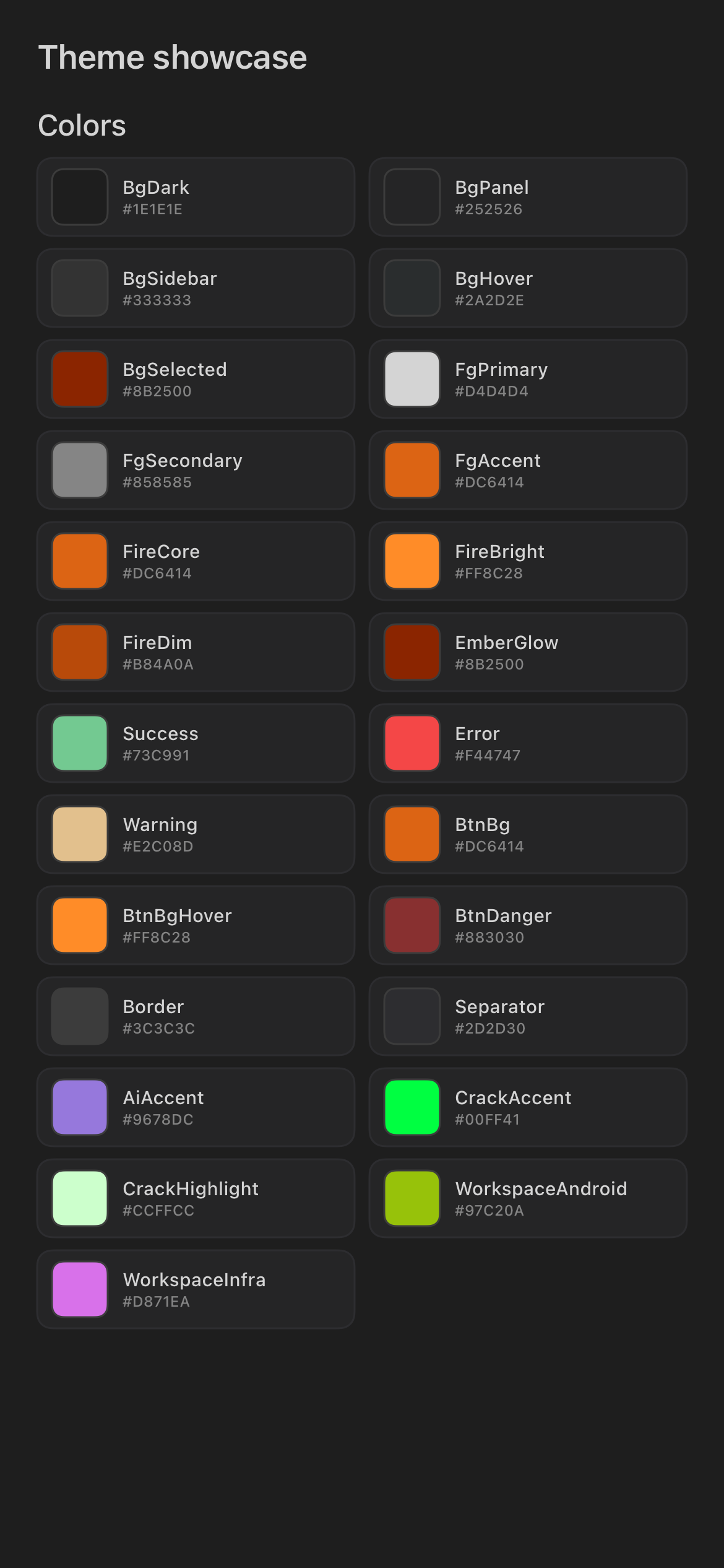
The mobile theme is a high-contrast dark interface built for repeated use while monitoring desktop work. Screens should feel like control surfaces: dense enough to scan, quiet enough to stay open, and clear about which action is primary.
| Android | iOS |
|---|---|
 |
 |
| Android theme tokens. | iOS theme tokens. |
Core theme roles. The two platforms are kept in exact 1:1 parity — the same hex values, inherited from the desktop theme — so a color means the same thing everywhere.
| Role | Color | User meaning |
|---|---|---|
| Background | #1E1E1E |
The app workspace. Most screens sit on a dark base so terminal output, notes, and status colors remain legible. |
| Panel | #252526 |
Grouped content such as task cards, settings sections, review panels, and selectors. |
| Sidebar/selected | #333333 / #8B2500 |
Raised surfaces and the ember-glow highlight for a selected row. |
| Border/separator | #3C3C3C / #2D2D30 |
Lightweight structure. Borders separate controls without making the app feel boxed in. |
| Primary text | #D4D4D4 |
Main labels, file names, note text, and commands. |
| Secondary text | #858585 |
Supporting metadata such as paths, timestamps, workspace names, and relay details. |
| Fire accent | #DC6414 |
The main action or brand emphasis. It usually means "do this now" rather than decoration. Brighter #FF8C28 marks a hover/active state. |
| Success green | #73C991 |
Connected, completed, running normally, or available. |
| Warning amber | #E2C08D |
Needs attention, paused, partial, stale, or not fully ready. |
| Error red | #F44747 |
Failed, unreachable, denied, or blocked. |
| AI accent | #9678DC |
AI-generated or review-oriented output where the screen needs a distinct highlight. |
| Workspace colors | (per workspace) | Stable identity markers derived deterministically from each workspace's key, mapped into colorblind-safe bands so the same workspace always looks the same. |
The mobile app itself uses one dark product theme. PDF export has its own document-theme picker so generated PDFs can use a reading or presentation style without changing the app shell.
Layout And Motion
Most screens use the same structure:
- A compact top area with the current workspace, title, sync state, or settings action.
- A scrollable body for notes, agent output, file lists, tasks, notifications, or settings sections.
- A single strong primary action when the screen has an obvious create/send/run command.
- Native sheets, dialogs, and menus for secondary choices.
Animations are functional: loading, syncing, listening, speaking, and dramatic branded effects. They are not required to understand the screen. If motion is reduced at the OS level, the app should still communicate state through labels, color, and stable controls.
Primitive Components
Primitive components are small reusable controls that keep both platforms readable. They show up across notes, agents, files, scheduled tasks, settings, and feedback.
Identity Rows
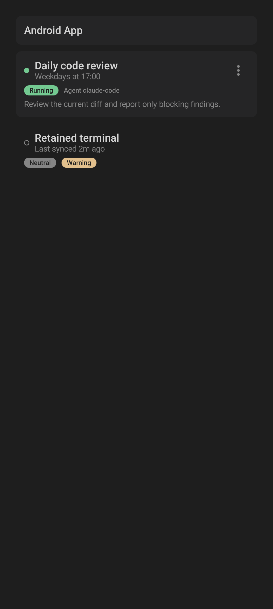
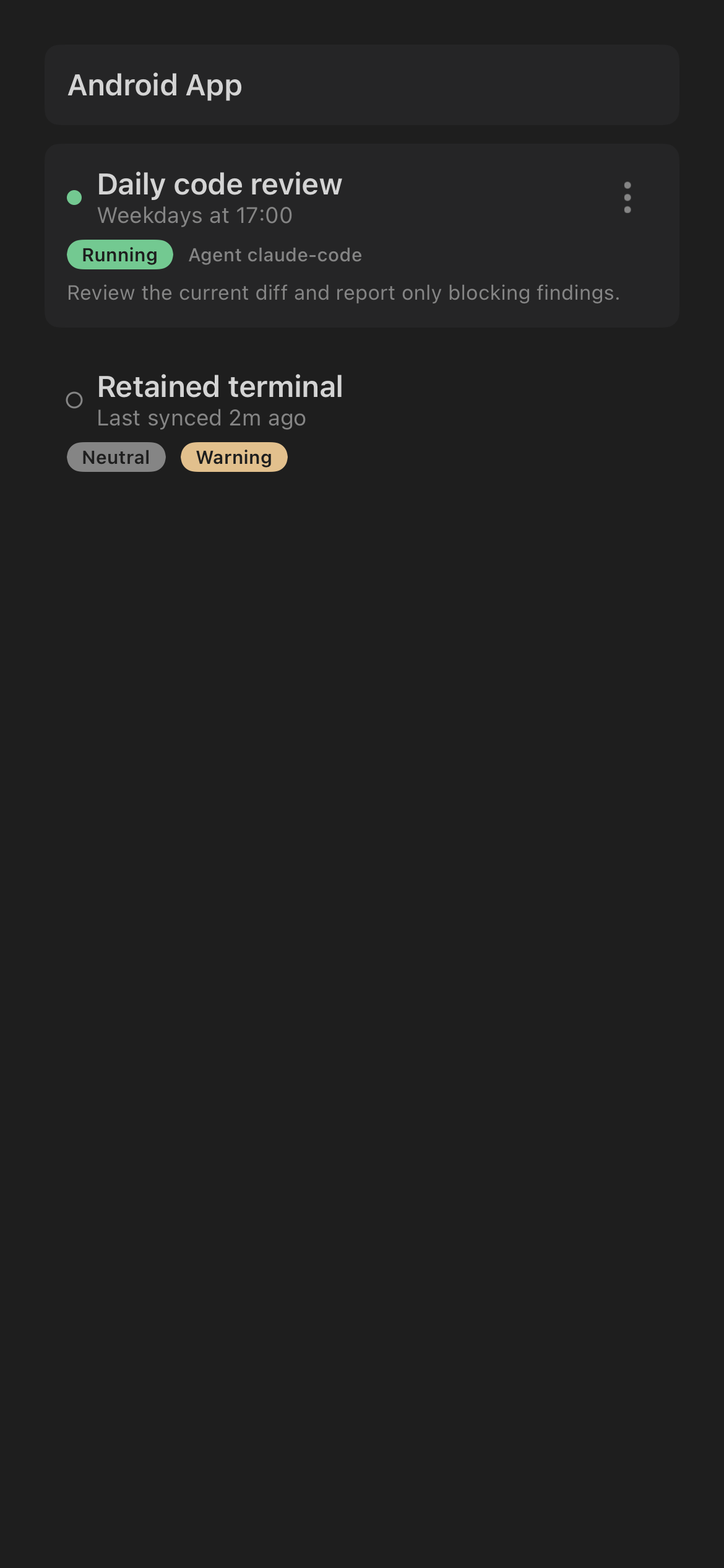
Identity rows pair an icon or mark with a name, subtitle, and optional status. They identify accounts, workspaces, sessions, files, and tasks.
| Android | iOS |
|---|---|
 |
 |
| Android identity row. | iOS identity row. |
When you see this pattern, read it as "this is the thing you are about to open, switch to, or manage." The subtitle normally carries the practical context: workspace, path, account email, schedule, or last activity.
Primary Actions
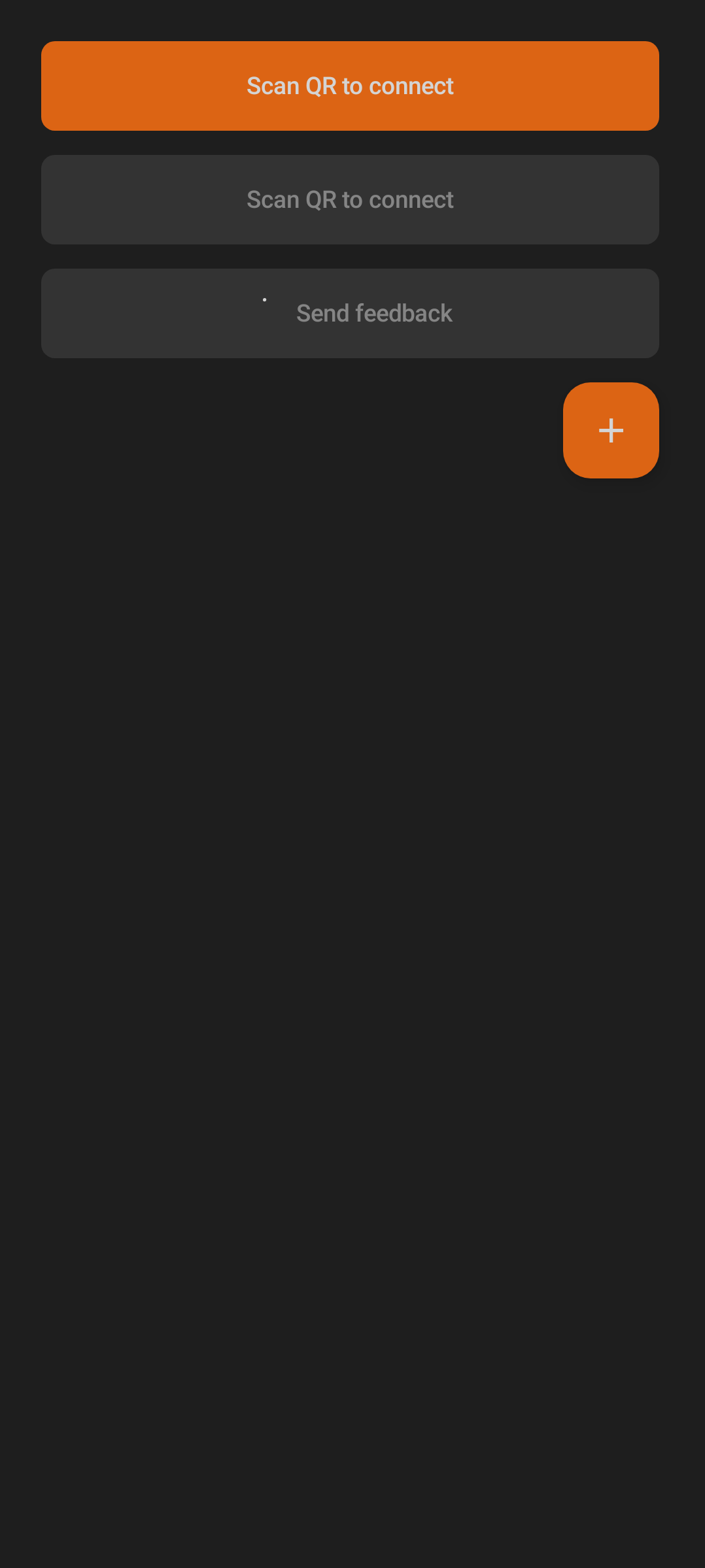
Primary actions use the fire accent because they are the next command the screen is built around: add a note, summon a session, create a Ritual, send input, or connect with QR pairing.
| Android | iOS |
|---|---|
 |
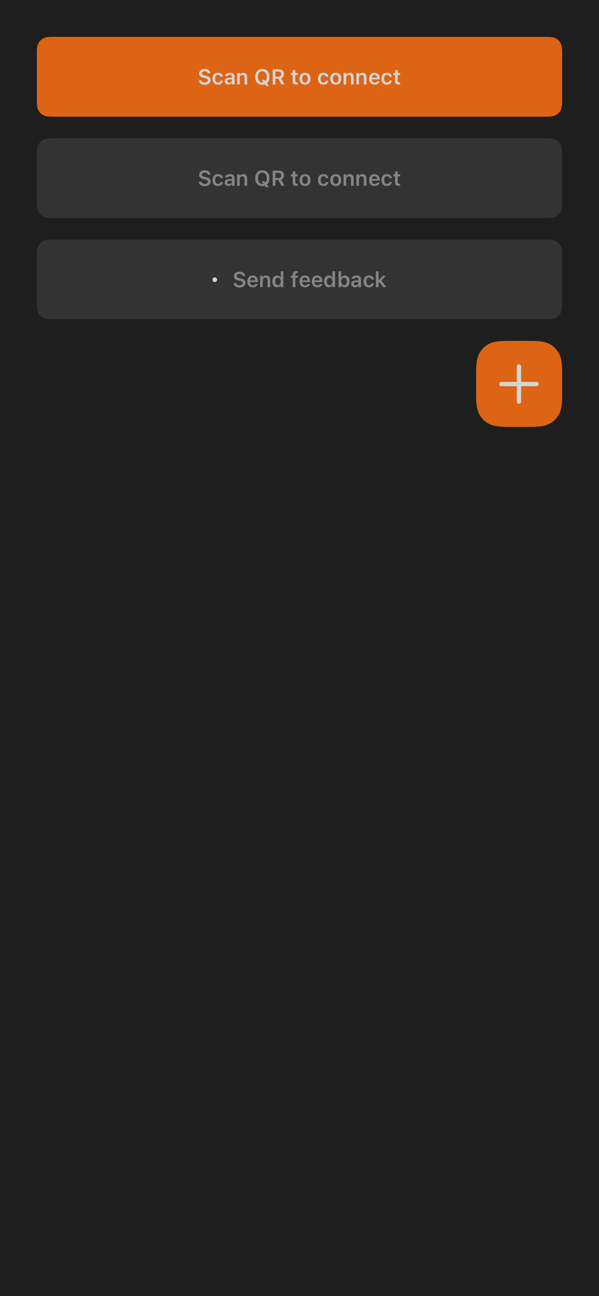 |
| Android primary actions. | iOS primary actions. |
Secondary actions are quieter. A screen should not require you to choose between several equally loud fire buttons; the strongest styling points to the main path.
Status Dots And Pills
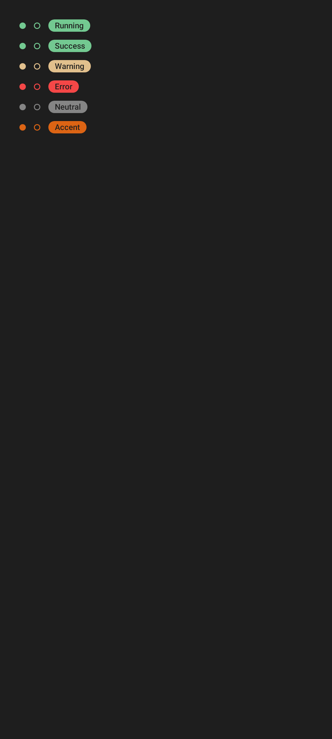
Dots and pills compress live state into small marks beside a label.
| Android | iOS |
|---|---|
 |
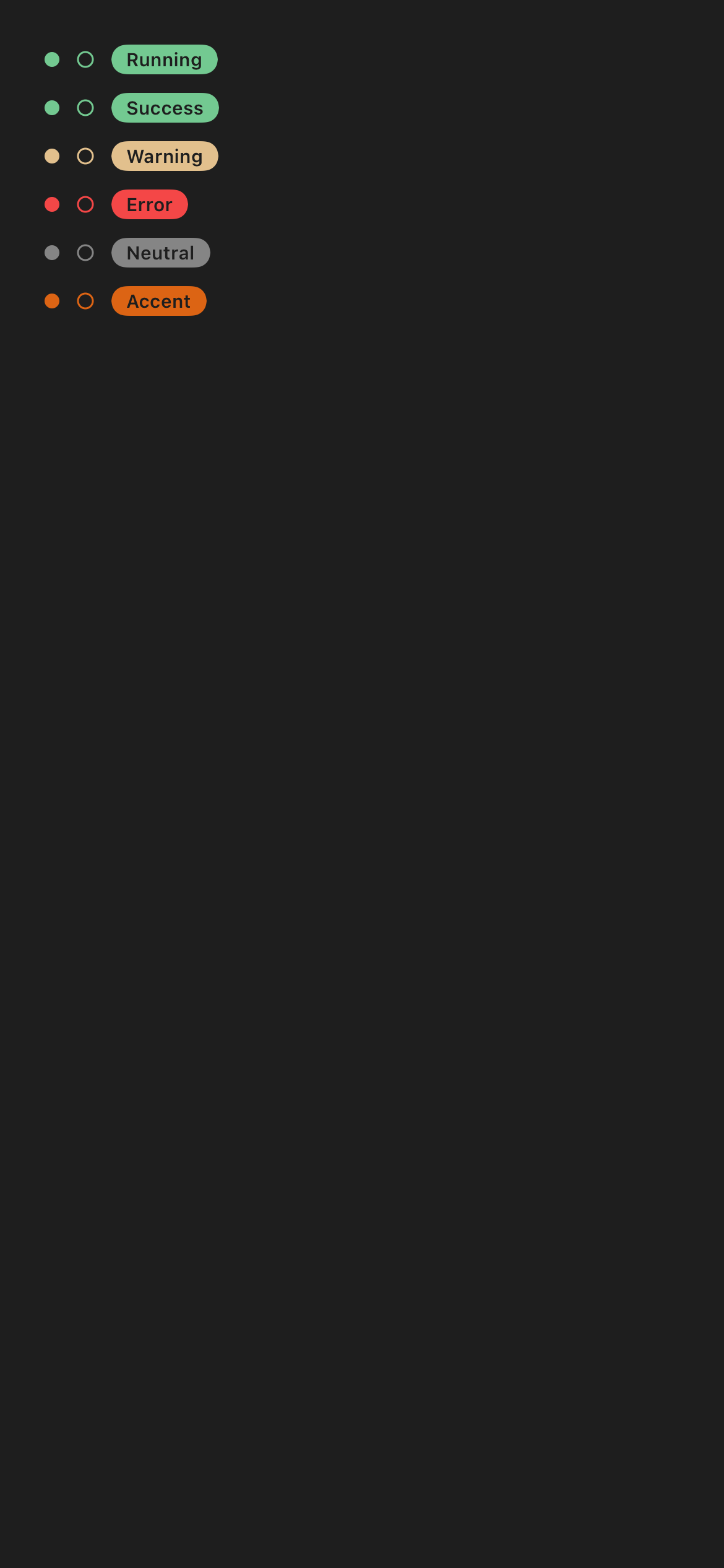 |
| Android status states. | iOS status states. |
Common readings:
| Status style | User meaning |
|---|---|
| Green dot or pill | Connected, complete, enabled, running normally, or ready. |
| Amber dot or pill | Waiting, stale, paused, disabled, preview-only, or needs a check. |
| Red dot or pill | Failed, disconnected, blocked, permission denied, or unreachable. |
| Neutral gray | Idle, unknown, empty, or not currently active. |
| Fire accent | Selected, active, primary, or currently being acted on. |
| Workspace-colored mark | Context marker, not an error or success signal by itself. |
Workspace Selector
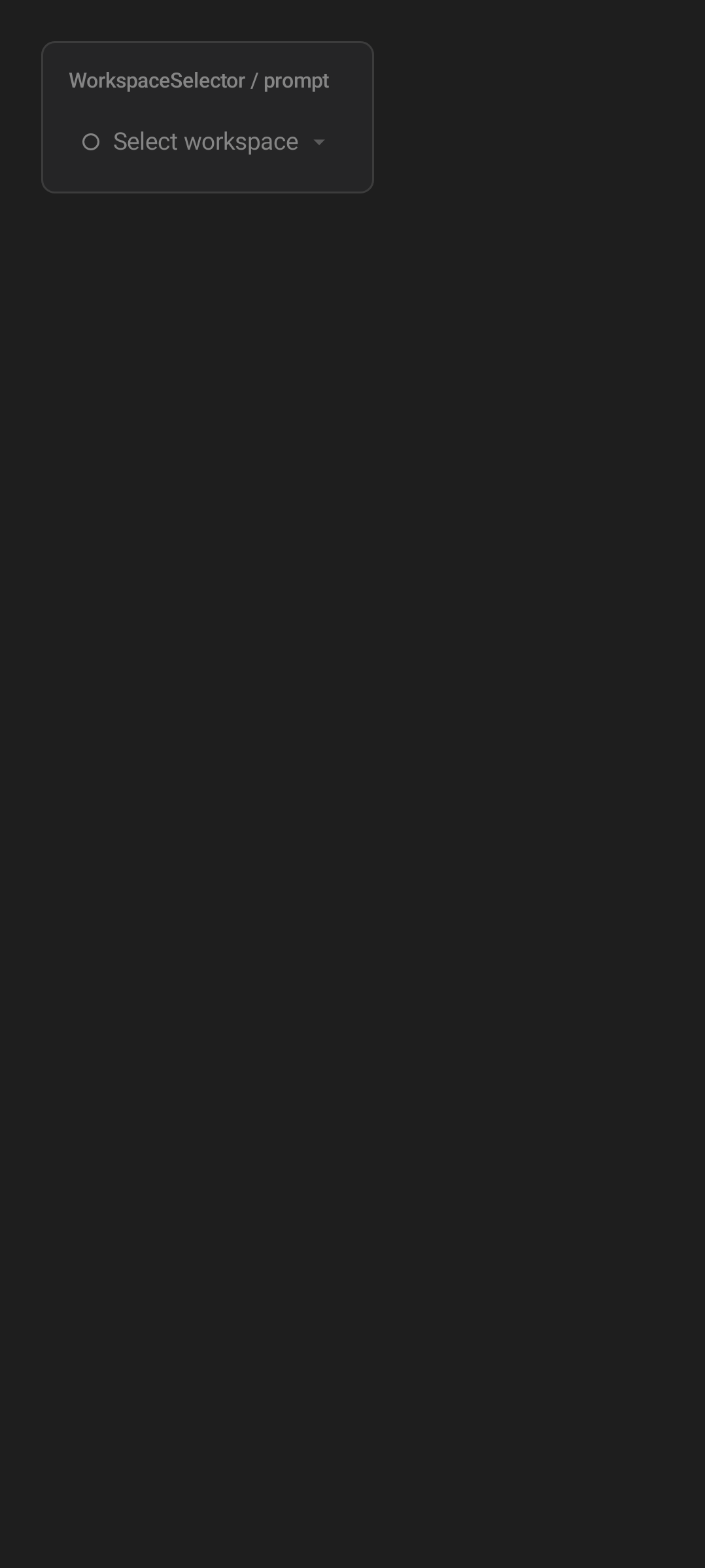
The workspace selector is the shared context switcher. It controls which notes, agents, files, tasks, and notifications are in focus.
| Android | iOS |
|---|---|
 |
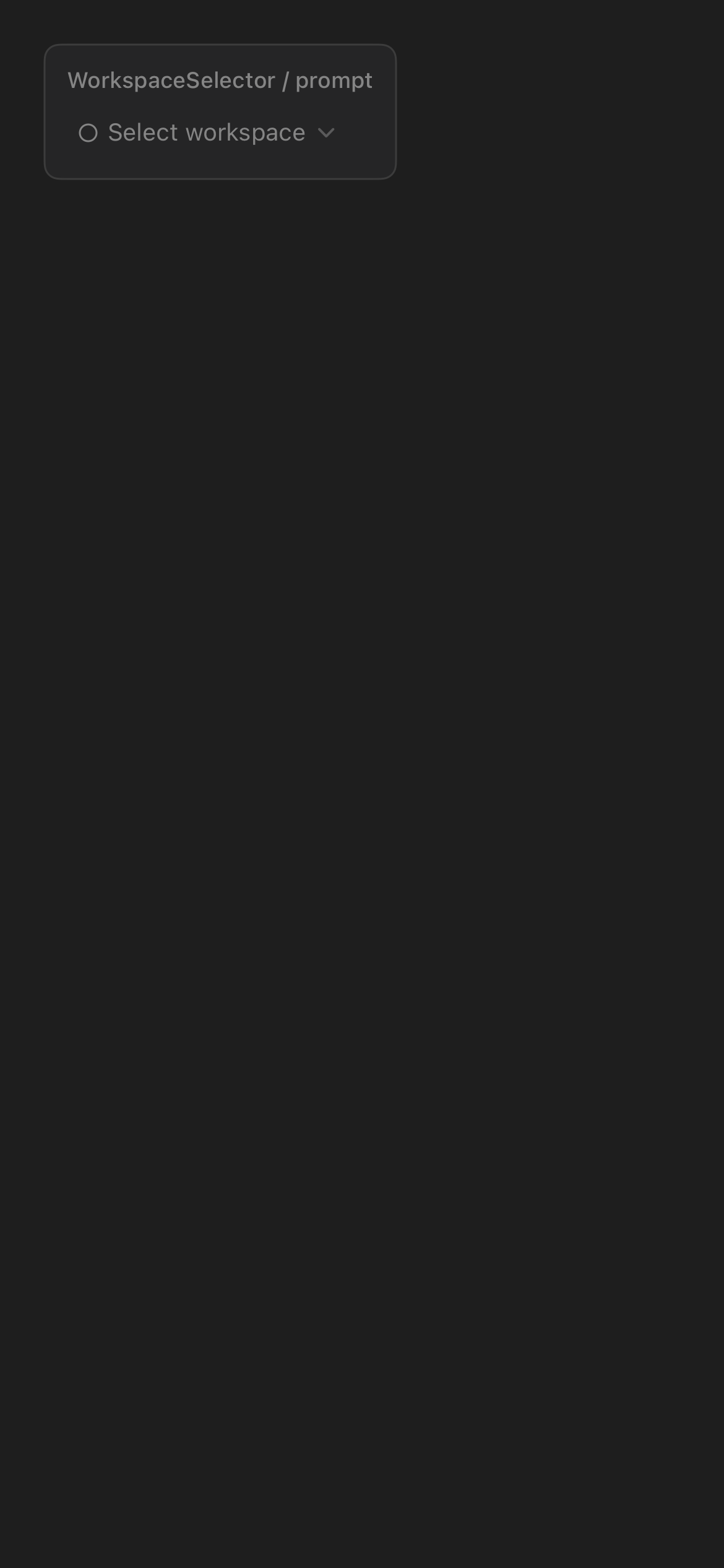 |
| Android workspace context switcher. | iOS workspace context switcher. |
Changing workspace changes what the rest of the app is showing. The selector is not only a label; it is the main way to avoid sending an agent prompt, note, or scheduled task to the wrong project context.
Dictation And Voice Input
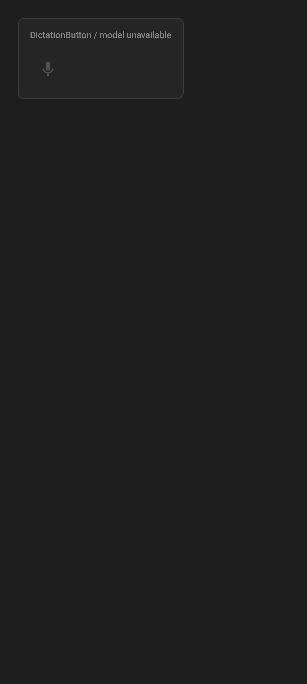
Dictation buttons turn spoken words into text for notes, prompts, review feedback, and other input surfaces.
| Android | iOS |
|---|---|
 |
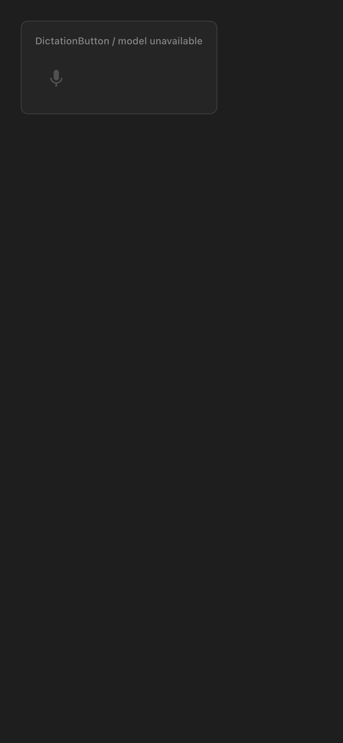 |
| Android dictation button. | iOS dictation button. |
| Android | iOS |
|---|---|
 |
 |
| Android listening state. | iOS listening state. |
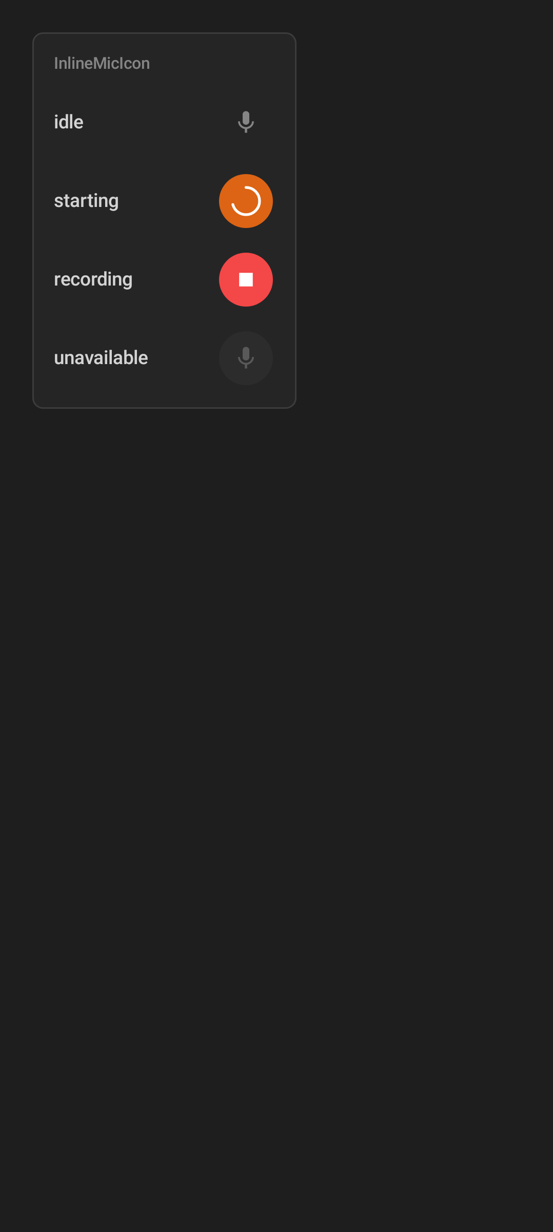
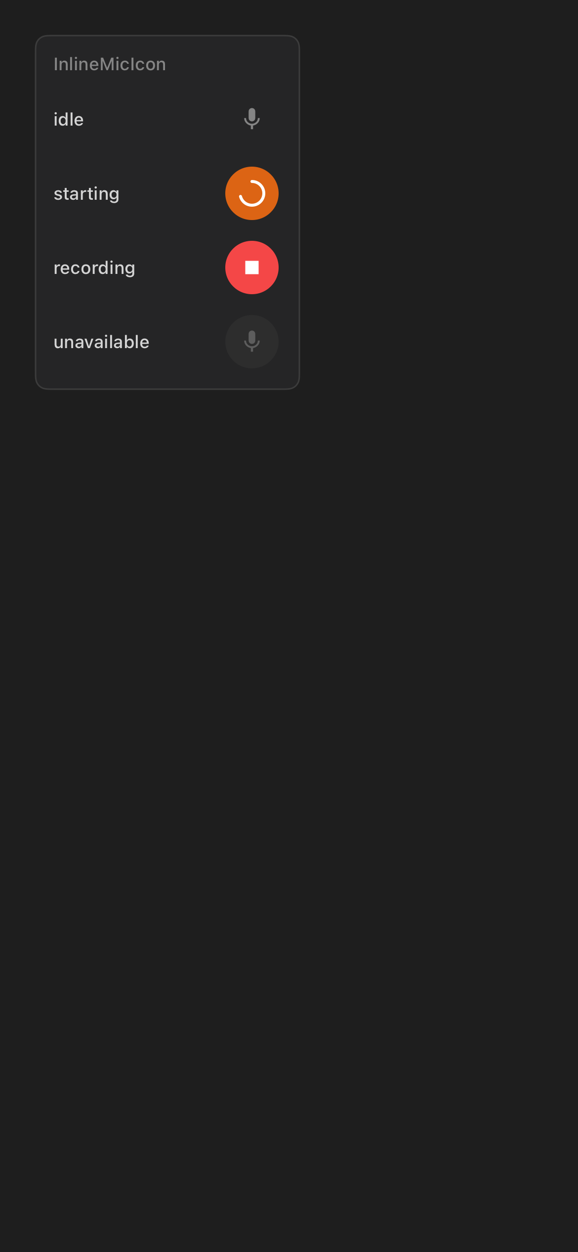
The microphone icon changes shape and color with state:
| State | What you see | User meaning |
|---|---|---|
| Idle | Gray microphone | Tap to start dictation. |
| Starting | Microphone briefly tinted fire, pulsing | The app is opening the mic. |
| Listening | Red Stop glyph, pulsing | Speak now; the app is capturing audio. Tap to stop. |
| Processing | Spinner in place of the icon | The app is turning speech into text. |
| Unavailable | Dimmed, disabled microphone | The on-device speech model is still downloading, or dictation is not available. |
There is no separate "error" icon: if microphone access is denied or a transcription fails, the button returns to the plain gray microphone and the failure is surfaced through a message or a permission prompt (on iOS, tapping can jump you to Settings) rather than a distinct color.
Voice Mode is different from dictation. Dictation fills a text field. Voice Mode is a live conversational control for an agent session.
Review Summary
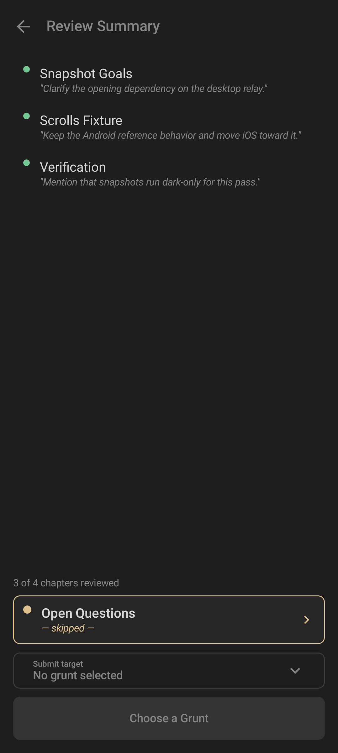
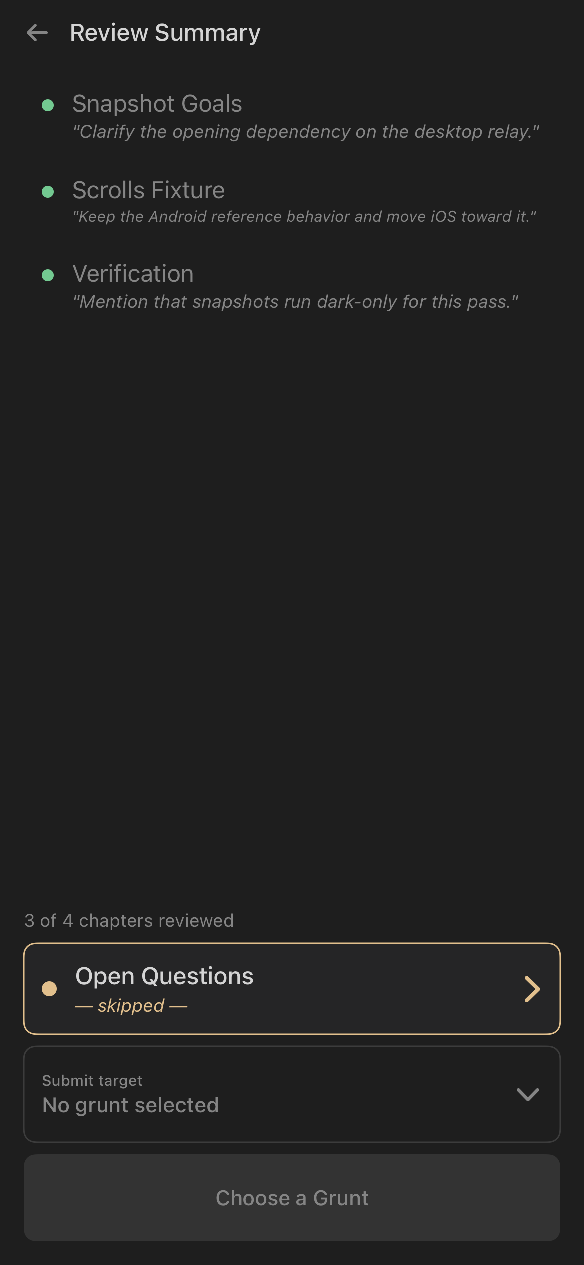
Review summaries show AI-generated file review output with a restrained structure: status first, then the substance of the review.
| Android | iOS |
|---|---|
 |
 |
| Android review summary. | iOS review summary. |
Treat review summaries as assistant output, not source of truth. Use the related file view, desktop context, and feedback controls when the review misses something.
Feedback Composer
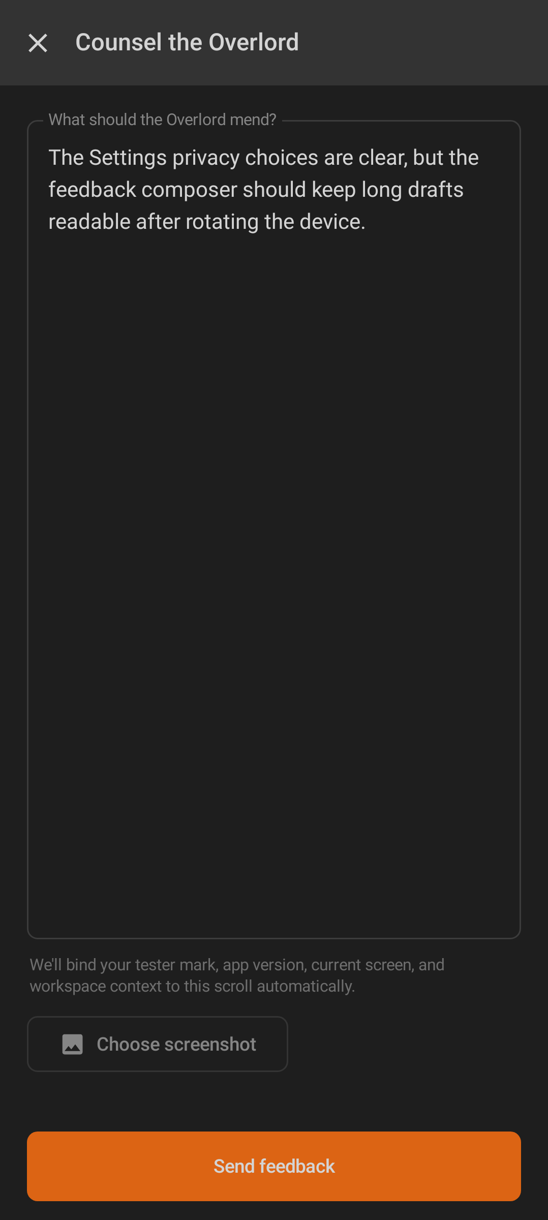
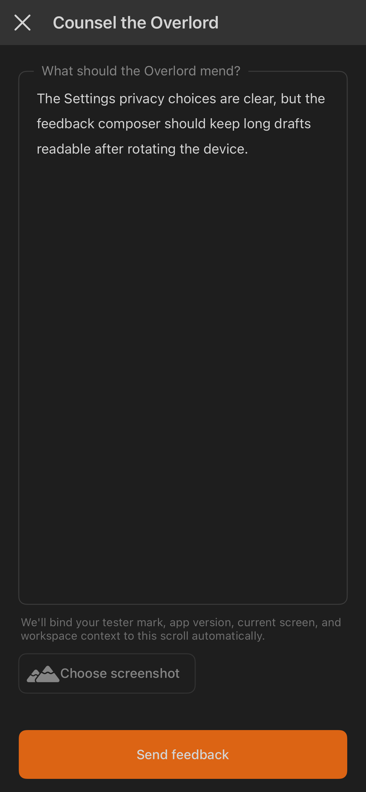
The feedback composer is intentionally direct: message, optional screenshot, send.
| Android | iOS |
|---|---|
 |
 |
| Android feedback composer. | iOS feedback composer. |
Use it for app feedback, confusing states, broken screenshots, or review-quality issues. It is separate from agent prompts; sending feedback does not instruct a Minion.
Status And Atmosphere
The product uses dramatic names and overlays, but the user meaning stays practical.
Omens
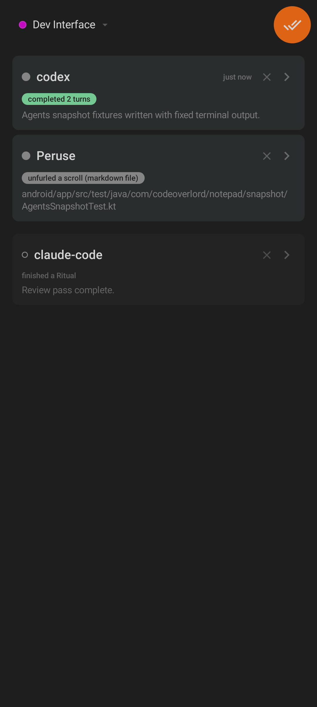
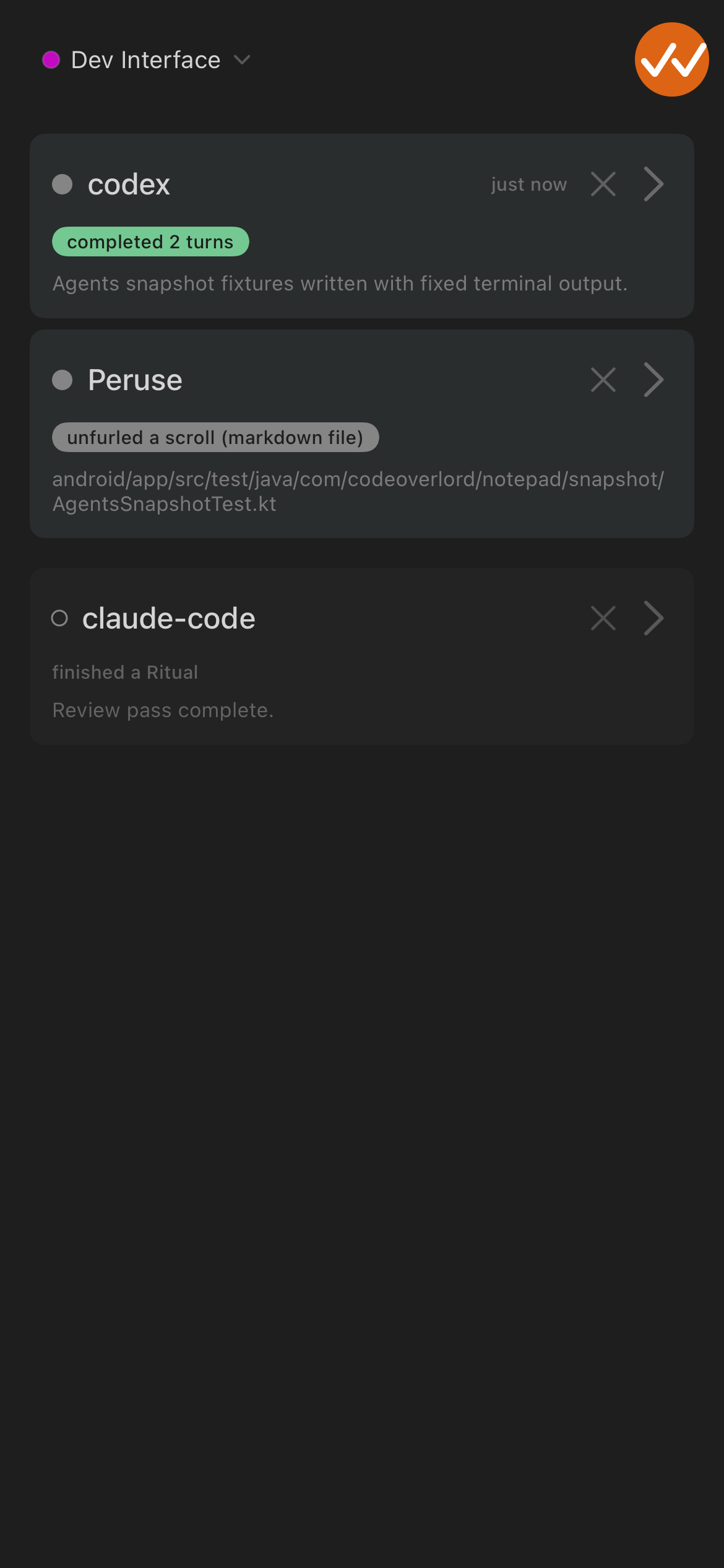
Omens are notifications. They are not warnings by default; they are an inbox of things the desktop or agents want mobile to notice.
| Android | iOS |
|---|---|
 |
 |
| Android Omens. | iOS Omens. |
An Omen may open a Scroll, jump to a Minion, or show a related Ritual. The row content tells you whether it is about a file, an agent session, a scheduled task, or general app activity.
FireText
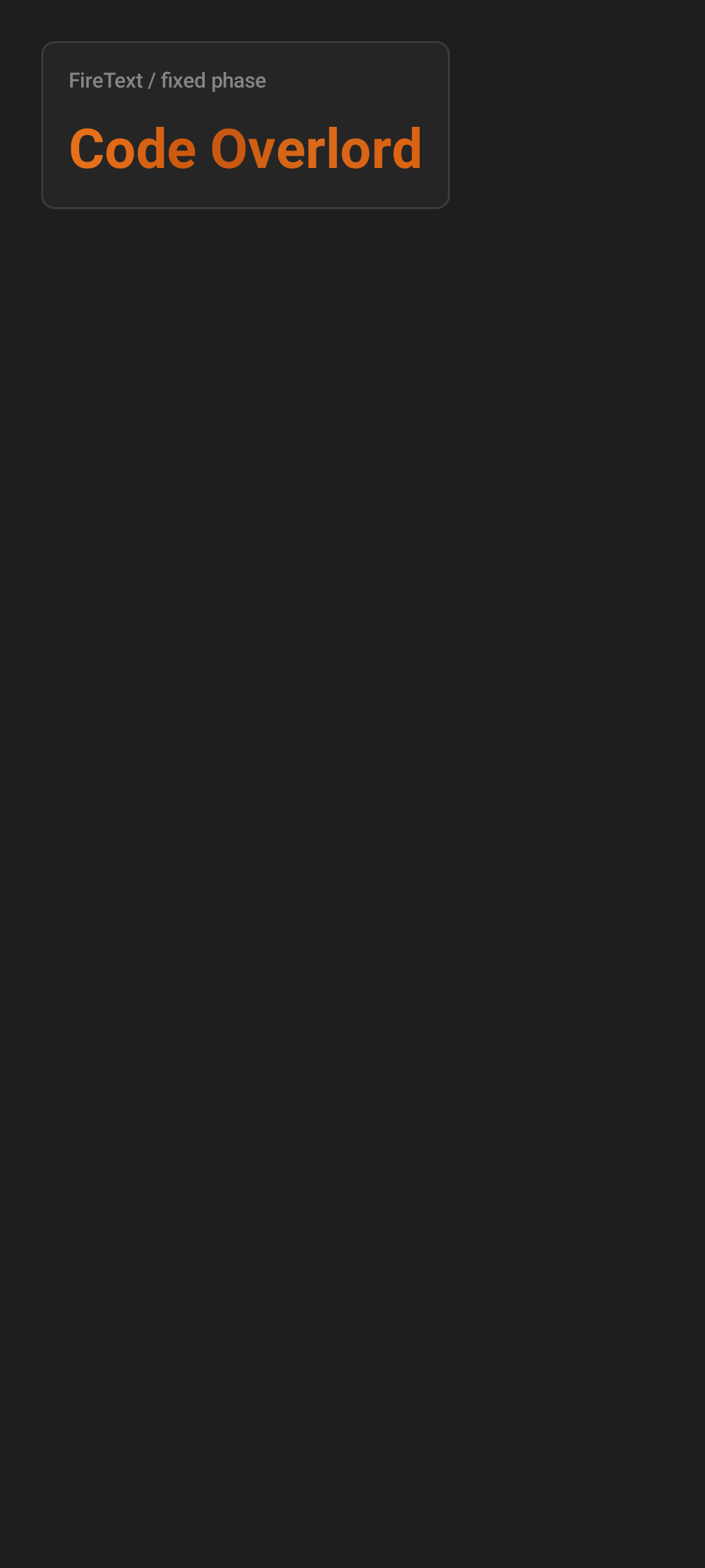
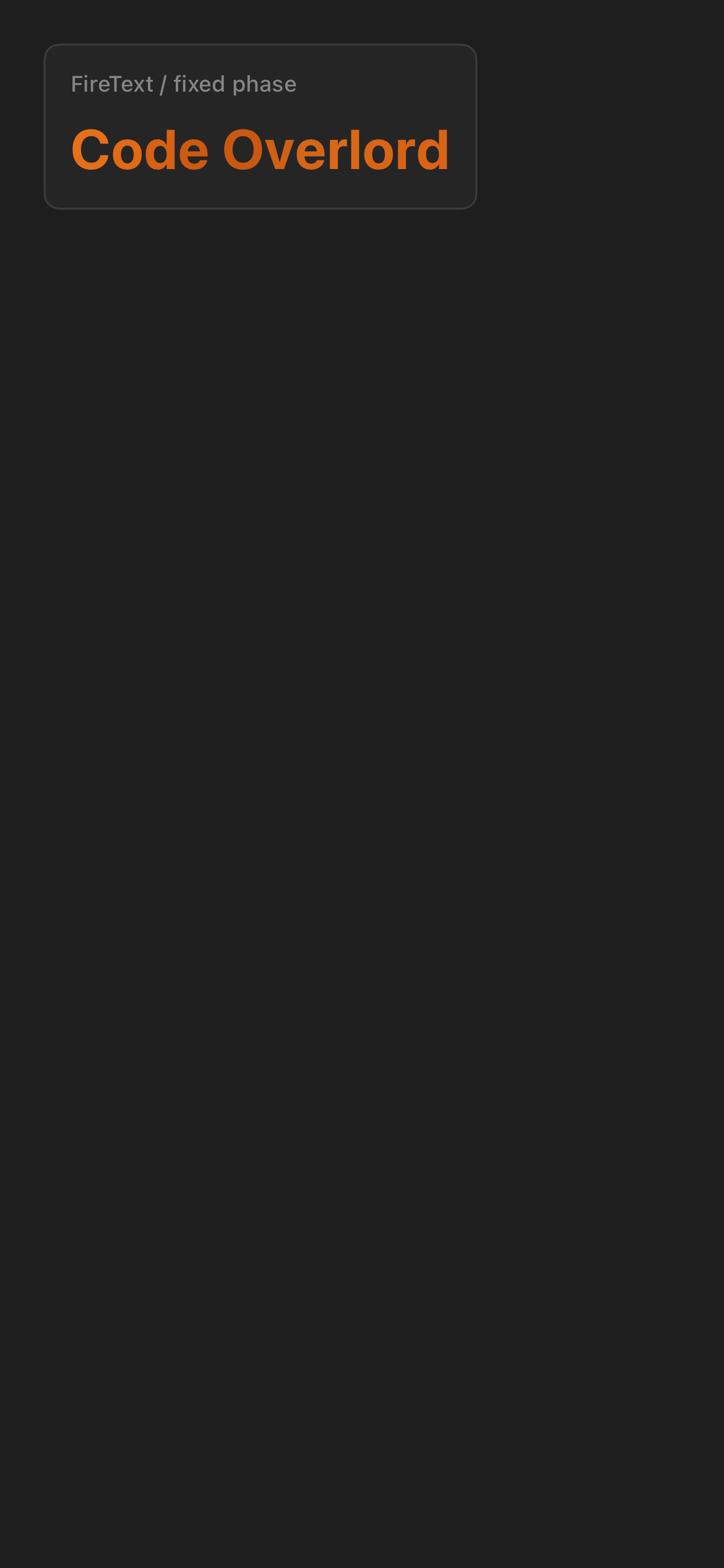
FireText is the animated wordmark used for high-emphasis title moments — the login and welcome screens and the app header render "Code Overlord" (Android frames it with crossed swords: "⚔ CODE OVERLORD ⚔").
| Android | iOS |
|---|---|
 |
 |
| Android FireText. | iOS FireText. |
The effect is a per-character color cycle: each letter drifts independently through the fire ramp (ember #B84A0A → orange #DC6414 → bright #FF8C28) on a slow two-second loop. It is warm animated lettering, not a literal glow or particle effect.
It does not mean a task is burning, failed, or urgent. When a real warning is present, the app uses explicit status text, warning colors, and action controls.
Screen-Crack Overlay
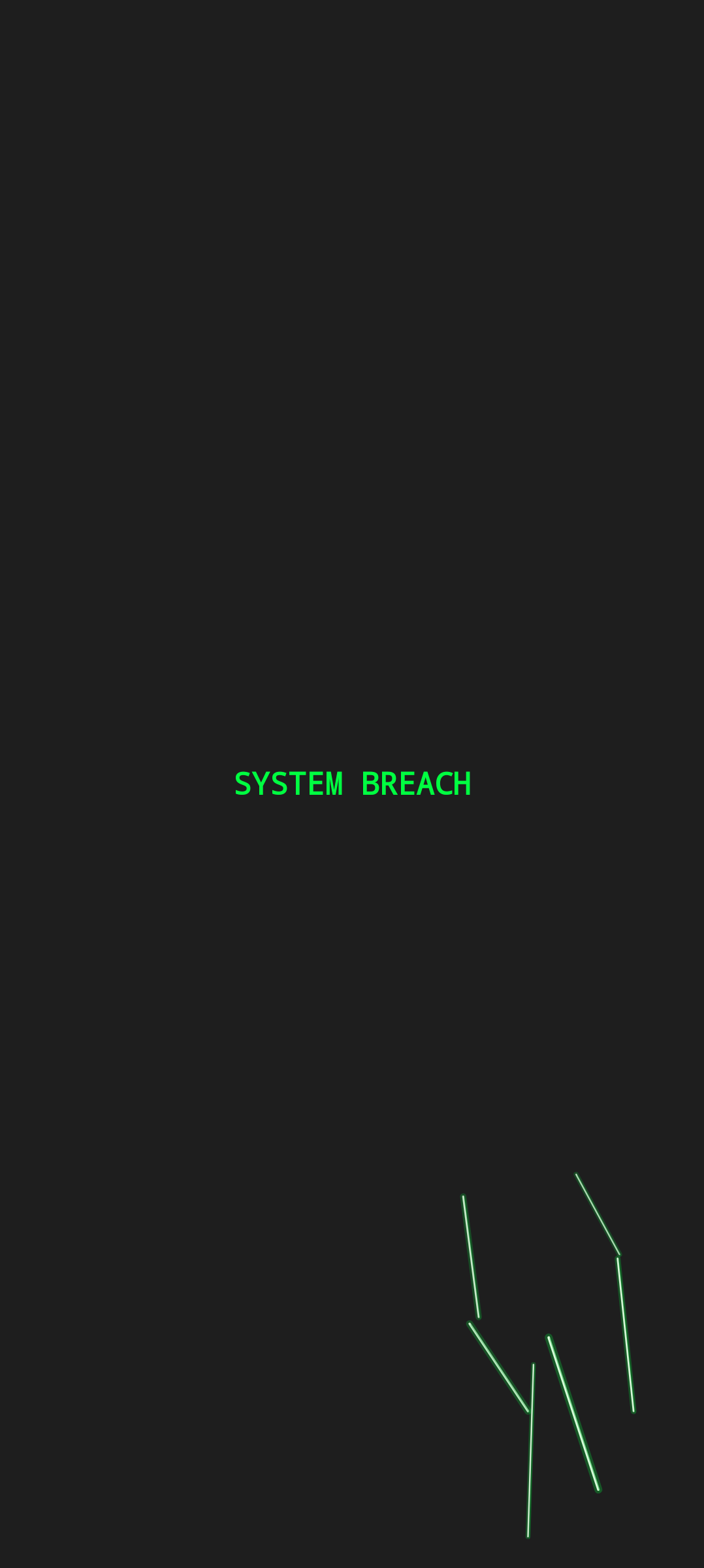
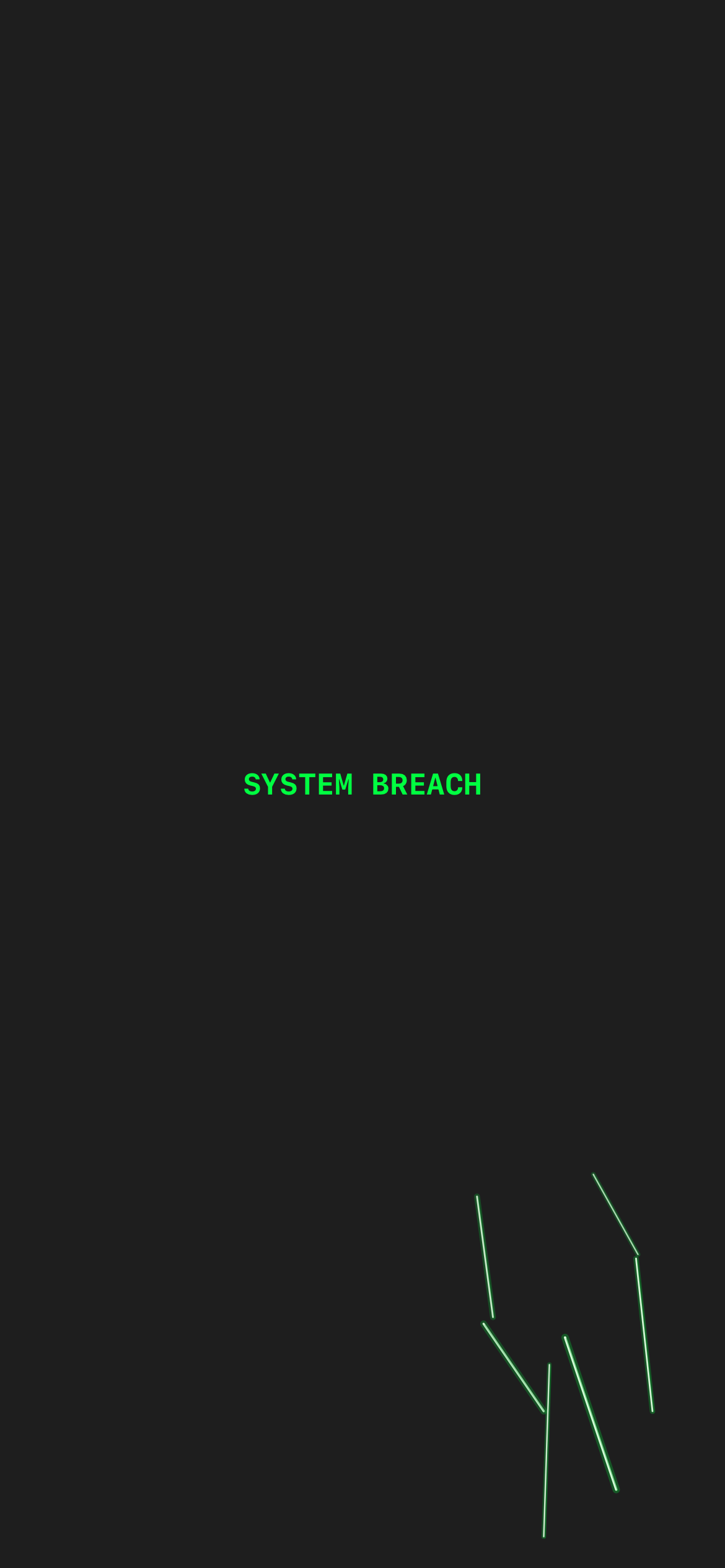
The screen-crack overlay is a playful Easter egg and atmosphere effect: glowing green terminal-style crack lines spread across a darkening screen, with a fake "SYSTEM BREACH" taunt.
| Android | iOS |
|---|---|
 |
 |
| Android screen crack overlay. | iOS screen crack overlay. |
How you trigger it: tap the Omens tab repeatedly. The first cracks appear around the fourth tap and grow with mock crash messages ("WARNING: Memory leak detected...", "KERNEL PANIC..."); on the eighth tap the screen "shatters" and the Dragon's Gauntlet game opens. Tapping app content clears the cracks, and navigating to another tab resets the count.
If it appears, it does not mean your device, account, relay, or codebase is damaged. Those crash messages are jokes. Real failure states use error text, red status marks, retry buttons, and permission or connection messaging.
Dragon's Gauntlet
Dragon's Gauntlet is the hidden mini-game unlocked by the screen-crack sequence above. It is a Flappy-Bird-style side-scroller: you flap a blinking text cursor through gaps in scrolling "code walls" while dodging bugs, over a backdrop of scrolling source. Both platforms ship the full game (not just an overlay). Exiting it returns you to the app and resets the tap counter. It has no effect on your work — it is purely for fun.
Platform Differences
| Area | Android | iOS |
|---|---|---|
| Controls | Compose Material buttons, menus, dialogs, floating action buttons, Android pickers | SwiftUI buttons, sheets, confirmation dialogs, share sheets, PhotosPicker, tab badges |
| Spacing | Material density and Android navigation conventions | iOS spacing, grouped lists, and sheet-based flows |
| Sharing/export | Android intents and post-export choices | Native share sheet and confirmation dialogs |
| Permissions | Android runtime permission prompts and settings recovery | iOS permission sheets and Settings recovery |
| Navigation | Routes and tabs with Android back behavior | Navigation stacks, sheets, and iOS tab behavior |
| Armoury (settings) | Opened from the Thy Quill top-bar gear as a full screen | Presented as a slide-up sheet (not a tab) |
The shared rule is that the same color, primitive, or overlay should mean the same thing on both platforms even when the native control differs.